Topology Studio
Maps built from real entities that colour themselves with live health — generated from a tenant, authored by hand, alerting on the service they draw, or built from a sentence with AI.
about 40 minutes · 39 slides. Each slide is followed by a description of what it shows — read top to bottom, this page is the walkthrough.
Overview
Topology Studio draws maps from real TrackMe entities, and every node colours itself with live health. A map can be generated from a tenant in a few clicks, authored by hand, made to alert on the service it draws, or built from a sentence with AI. Every screen was captured on TrackMe 2.4.18 running on Splunk Enterprise, against a production-like deployment with several tenants.
The walkthrough has four parts: generating a map from a tenant, building one from an empty canvas with aggregates and auto-generated members, alerting on the map, and building one from a sentence with AI. It closes with a few maps that run in production every day.
Why an entity list is not enough
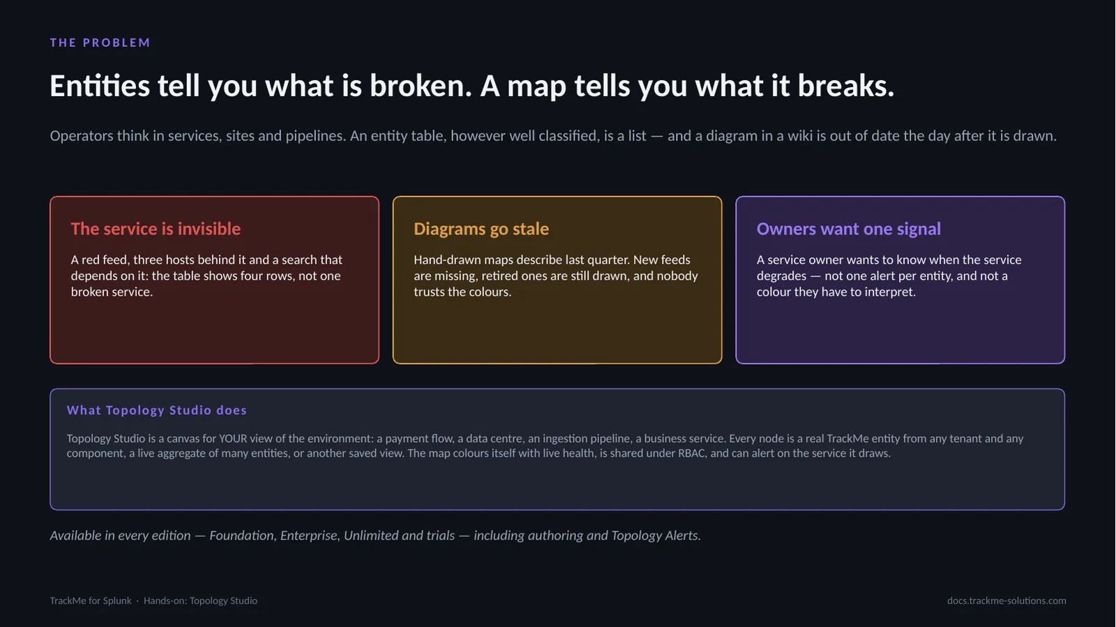
An entity table is a list: a red feed, three hosts behind it and a search that depends on it show as four rows, not one broken service. Hand-drawn diagrams go stale within a week. A service owner wants one signal when the service degrades, not one alert per entity.
Topology Studio is a canvas for the operator’s own view of the environment, such as a payment flow or a business service. Every node is a real TrackMe entity from any tenant and component, a live aggregate of many entities, or another saved view. The map colours itself with live health, is shared under RBAC, can alert on the service it draws, and is available in every edition, including trials.
Views, node types and live health
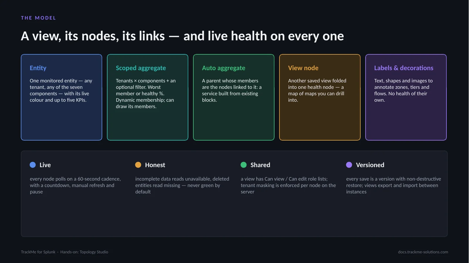
A view is one map: an id, a display name, a category and two role lists, Can view and Can edit. An Entity node is one monitored entity with up to five KPIs. A Scoped aggregate rolls up tenants × components plus an optional filter, with worst-member or healthy-percentage health and dynamic membership. An Auto aggregate is a parent whose members are the nodes linked to it. A View node folds another saved view into one health node. Labels and decorations carry no health.
Every node polls every 60 seconds. Incomplete data reads unavailable and a deleted entity reads missing, never green by default. Tenant masking is enforced per node on the server, and every save is a restorable version.
Four routes to a live map
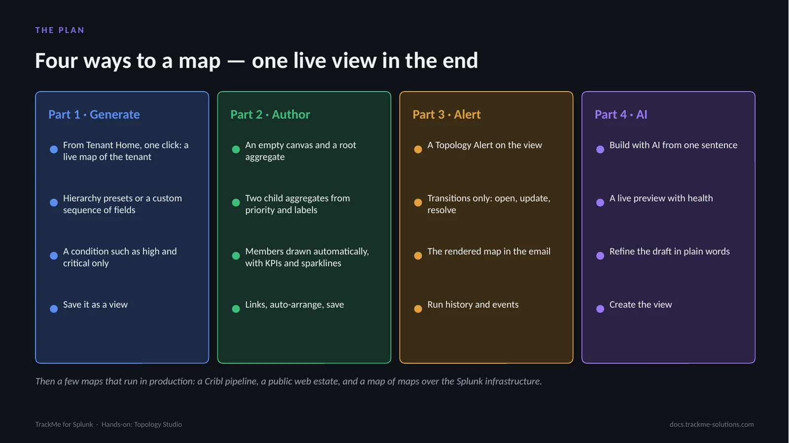
The four parts are not steps of one procedure; each is a way to obtain a live map. Part 1 generates a map from Tenant Home in one click, with a chosen hierarchy and an optional condition. Part 2 authors a map from an empty canvas: a root aggregate, two child aggregates from priority and labels, members drawn automatically with KPIs and sparklines.
Part 3 attaches a Topology Alert to the view, notifying on transitions only with the rendered map in the email. Part 4 builds a map with AI from one sentence and refines it in plain words. In production follows: a Cribl pipeline, a web estate and a map of maps.
Part 1 — Generate
The fastest way to a map starts from a tenant that already knows its own structure: indexes, tags, priorities and labels. Tenant Home turns any tenant into a structured topology, with a root aggregate and one live aggregate per group, in any hierarchy. The operator picks the hierarchy, narrows it with a condition and saves it as a view once it is right. The generated map is temporary until it is saved.
Opening the topology from Tenant Home
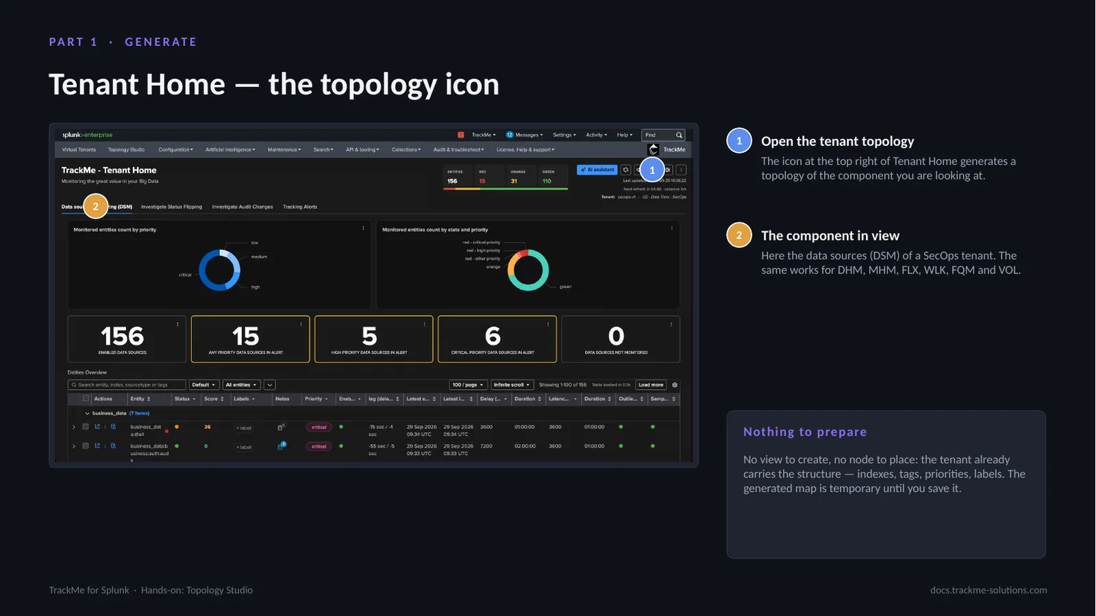
The topology icon at the top right of Tenant Home (callout 1) generates a topology of the component in view; callout 2 marks that component. Here it is the data sources (DSM) of a SecOps tenant tracking a few hundred data sources; the same works for DHM, MHM, FLX, WLK, FQM and VOL. The icon opens a full-screen panel with three tabs, Topology Studio, Link graph and Network graph; the Topology Studio tab is the one used here.
Nothing needs preparing: no view to create and no node to place, because the tenant already carries the structure in its indexes, tags, priorities and labels. The generated map stays temporary until it is saved.
The temporary topology and its controls
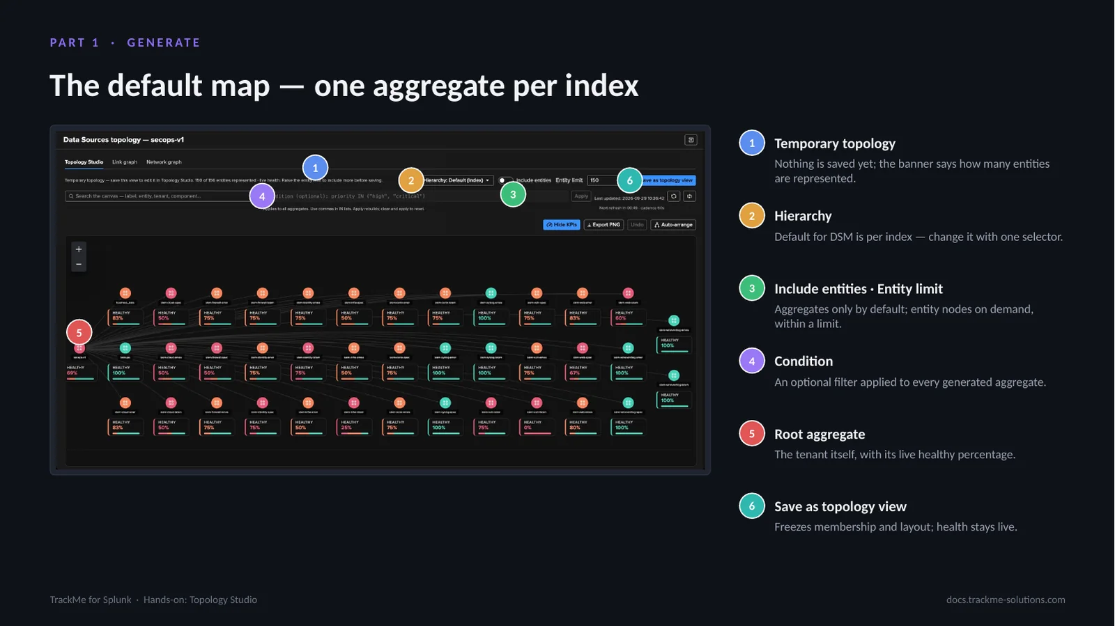
The generated map opens as a temporary topology (callout 1): nothing is saved yet, and the banner says how many entities are represented. Hierarchy (callout 2) is one selector, defaulting per component: index for DSM, group for FLX, overgroup for WLK, datamodel for FQM, the tenant root for DHM and MHM. Include entities and Entity limit (callout 3) add individual entity nodes on demand, within a limit; aggregates only is the default. Condition (callout 4) is an optional filter applied to every generated aggregate.
The Root aggregate (callout 5) is the tenant itself with its live healthy percentage; only monitored entities are included. Save as topology view (callout 6) freezes membership and layout while health stays live.
Hierarchy presets per component
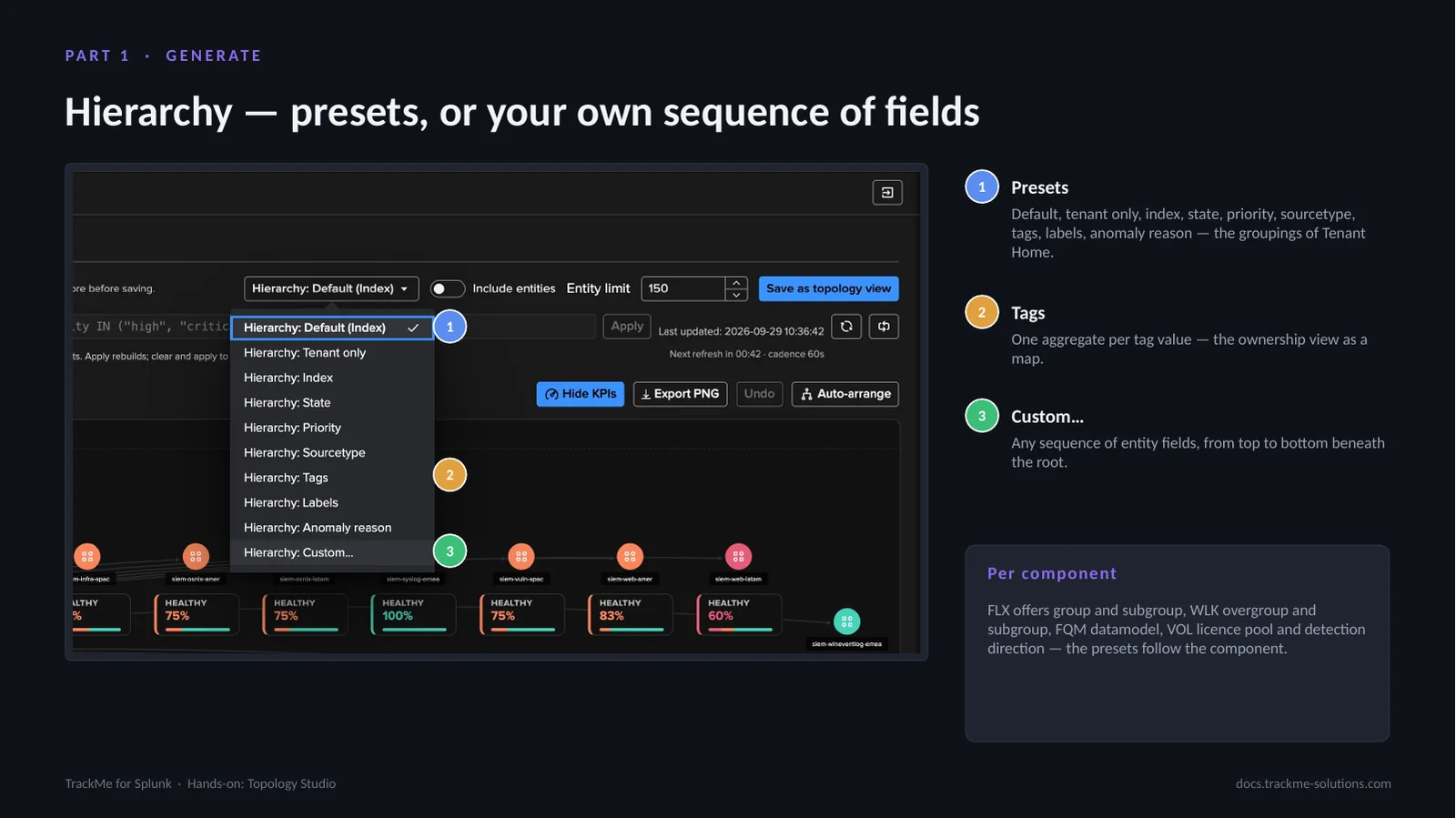
The hierarchy selector lists Presets (callout 1): Default, tenant only, index, state, priority, sourcetype, tags, labels and anomaly reason, the same groupings as the Tenant Home table. Choosing Tags (callout 2) gives one aggregate per tag value, the ownership view as a map. Custom… (callout 3) opens a dialog to choose any sequence of entity fields, from top to bottom beneath the root.
The presets follow the component: FLX offers group and subgroup, WLK overgroup and subgroup, FQM datamodel, and VOL licence pool and detection direction.
Building a custom hierarchy
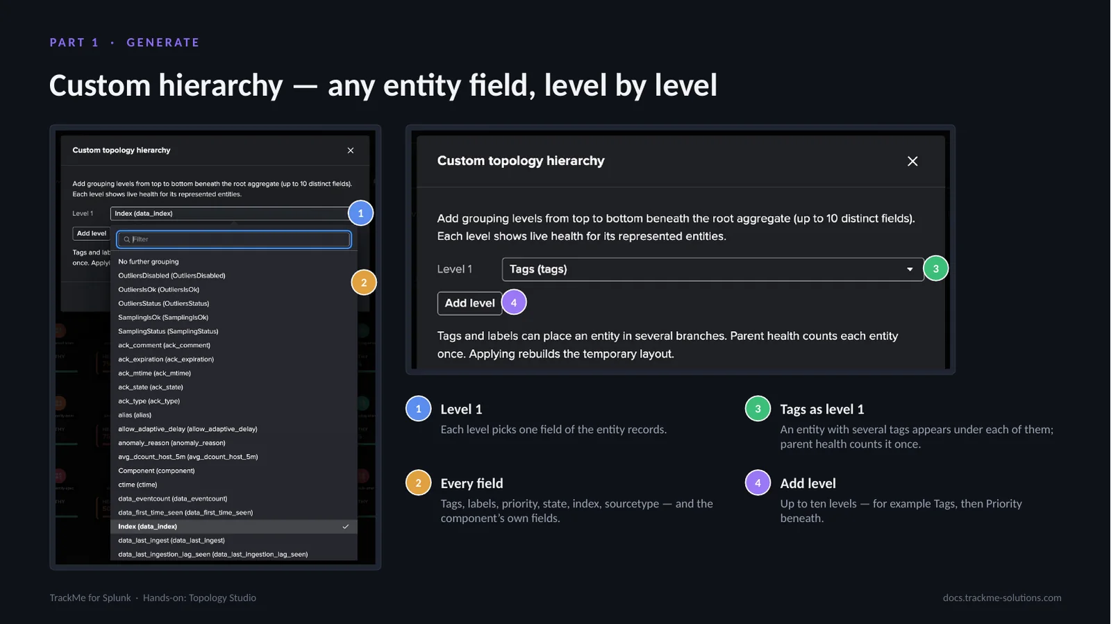
The custom hierarchy dialog defines grouping levels from top to bottom beneath the root aggregate. Each level (callout 1) picks one field of the entity records; here Tags is the single level. Every field (callout 2) of the records is offered: tags, labels, priority, state, index, sourcetype and the component’s own fields. An entity with several tags appears under each of them, while the parent health still counts it once (callout 3). Add level (callout 4) adds up to ten distinct levels, for example Tags with Priority beneath. Applying rebuilds the temporary layout.
One aggregate per tag
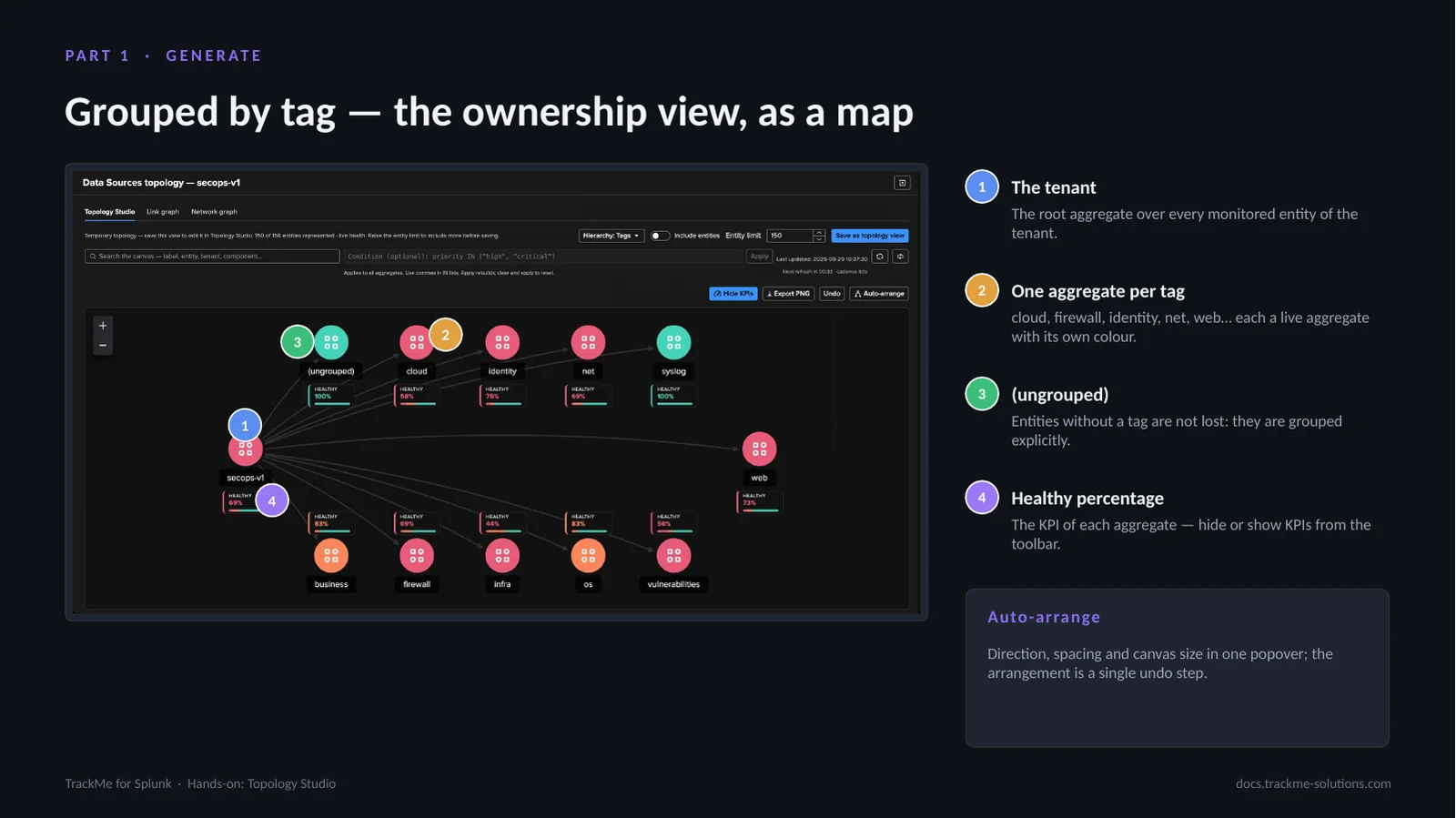
With Tags as the hierarchy, the map shows the tenant as its owners see it. The root aggregate (callout 1) covers every monitored entity of the tenant. Beneath it sits one aggregate per tag (callout 2): cloud, firewall, identity, net, web and so on, each a live aggregate with its own colour. Entities without a tag are not lost; the (ungrouped) node (callout 3) collects them explicitly. The healthy percentage (callout 4) is the KPI of each aggregate; KPIs can be hidden or shown from the toolbar.
Auto-arrange lays the map out from one popover, with direction, spacing from compact to spacious and canvas size; the arrangement is a single undo step.
Narrowing the map with a condition
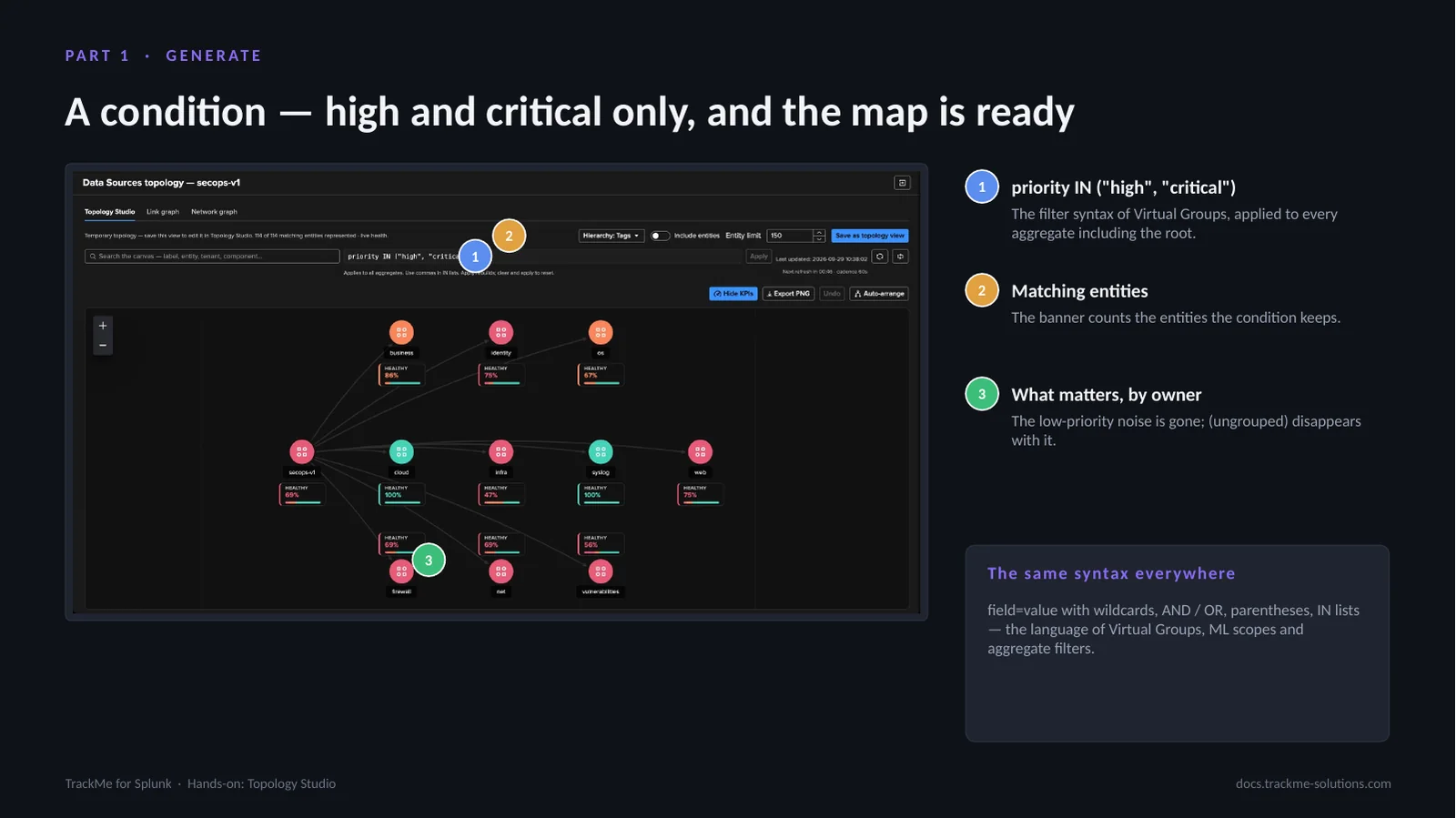
A condition narrows the whole map. The expression priority IN (“high”, “critical”) (callout 1) uses the filter syntax of Virtual Groups and is applied to every aggregate, including the root. The banner (callout 2) counts the matching entities the condition keeps. The result (callout 3) is what matters, by owner: the low-priority noise is gone, and the (ungrouped) node disappears with it. This is the on-call view a SecOps lead would put on a screen; clearing the condition and applying resets the map.
The same syntax is used everywhere in TrackMe: field=value with wildcards, AND / OR, parentheses and IN lists, the language of Virtual Groups, ML scopes and aggregate filters.
Saving the generated map as a view
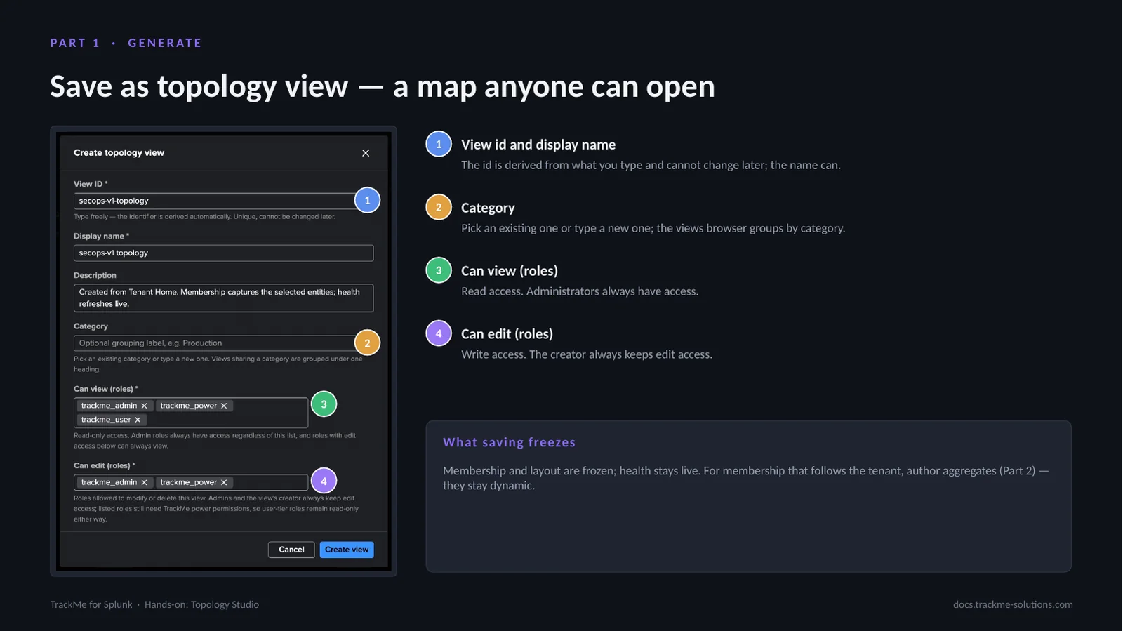
Save as topology view opens the create dialog. View id and display name (callout 1): the id is derived from what is typed and cannot change later, while the name can. Category (callout 2) accepts an existing value or a new one; the views browser groups views by category. Can view (callout 3) lists the roles with read access; administrators always have access. Can edit (callout 4) lists the roles with write access; the creator always keeps edit access. A description can also be entered.
Saving freezes membership and layout while health stays live. For membership that follows the tenant as new entities appear, authored aggregates (Part 2) stay dynamic.
Part 2 — Author
Authoring by hand is the way most service maps are built: start from the service, describe its parts with aggregates, and let the members draw themselves. From an empty canvas, this part creates a root aggregate, two child aggregates built from priority and labels, and members drawn automatically with KPIs and sparklines, then links, arranges and saves the result as a live service map.
The target: a web platform map
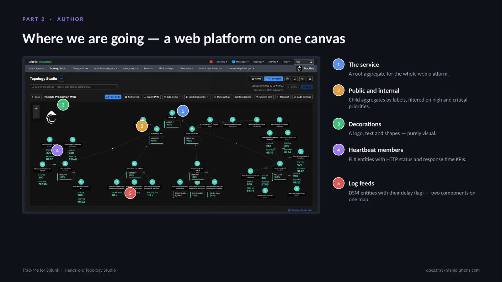
The target is a map that runs in production, the web platform of TrackMe itself, rebuilt as a skeleton from an empty canvas in a few minutes. The service (callout 1) is a root aggregate for the whole web platform. Public and internal (callout 2) are child aggregates by labels, filtered on high and critical priorities. Decorations (callout 3), a logo, text and shapes, are purely visual. Heartbeat members (callout 4) are FLX entities with HTTP status and response time KPIs. Log feeds (callout 5) are DSM entities with their delay (lag), so two components share one map.
Starting an empty view
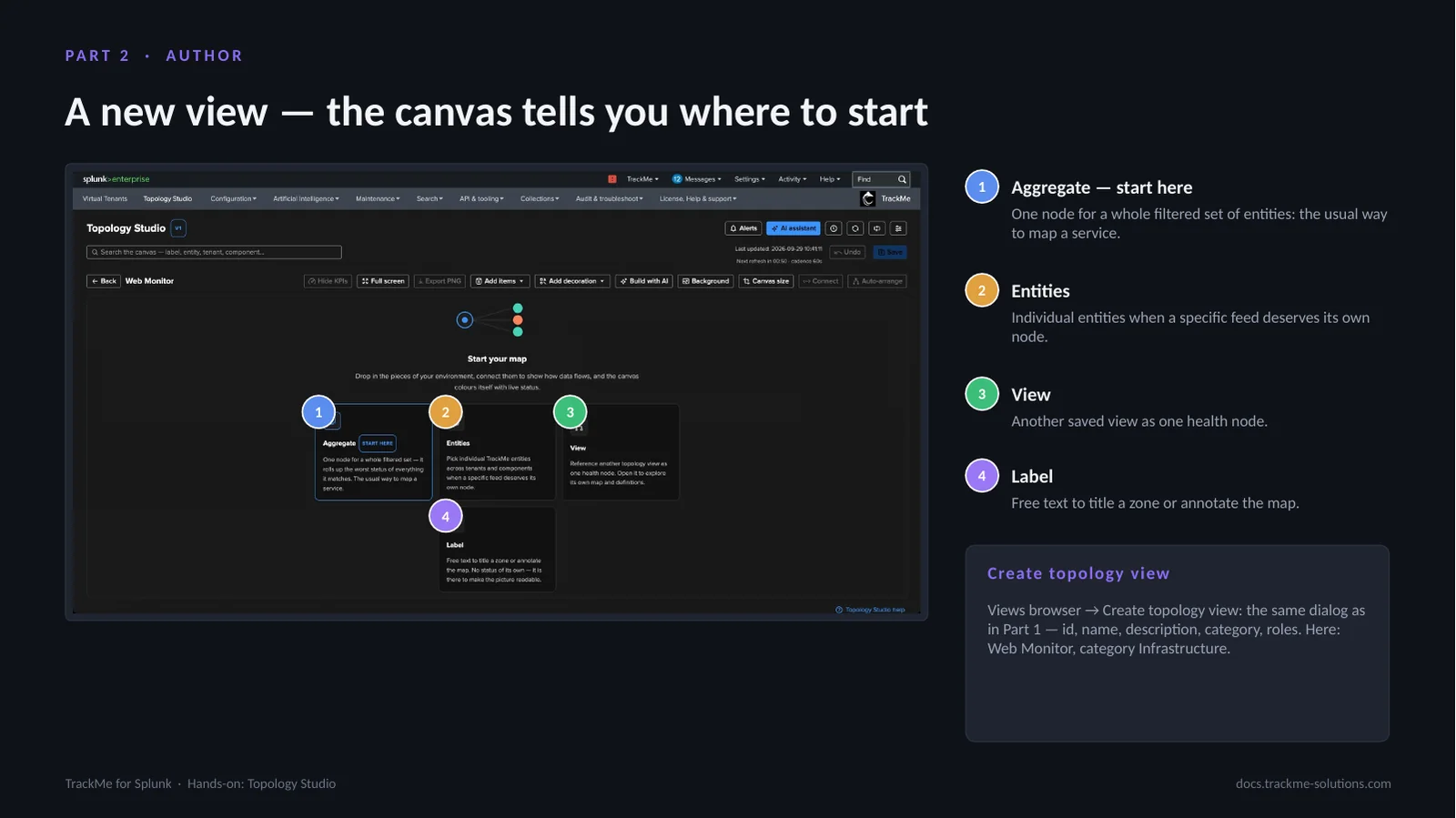
A view called Web Monitor, category Infrastructure, is created from the views browser with Create topology view, the same dialog as in Part 1: id, name, description, category and roles. An empty view opens on the Start your map guide with four starting points. Aggregate (callout 1) is one node for a whole filtered set of entities, the usual way to map a service and the guide’s recommendation. Entities (callout 2) adds individual entities when a specific feed deserves its own node. View (callout 3) adds another saved view as one health node. Label (callout 4) is free text to title a zone or annotate the map.
Defining the root aggregate
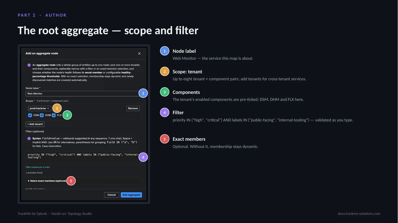
In the aggregate dialog, Node label (callout 1) is Web Monitor, the service the map is about. Scope: tenant (callout 2) takes up to eight tenant × component pairs; more tenants can be added for cross-tenant services. Components (callout 3) pre-ticks the tenant’s enabled components, DSM, DHM and FLX here. Filter (callout 4) uses the same syntax as Part 1, validated as it is typed: priority IN (“high”, “critical”) AND labels IN (“public-facing”, “internal-tooling”). The labels come from the TrackMe label rules and the priorities from the policies. Exact members (callout 5) is optional; without it, membership stays dynamic and entities that start matching later join the aggregate by themselves.
Health calculation and member preview
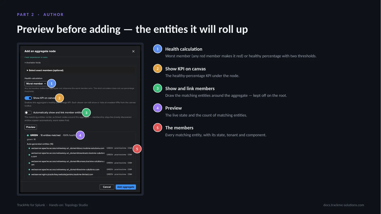
Health calculation (callout 1) is either worst member, where any red member makes the aggregate red, or healthy percentage with two thresholds, by default green from 90 percent and orange from 75. Show KPI on canvas (callout 2) displays the healthy-percentage KPI under the node. Show and link members (callout 3) draws the matching entities around the aggregate; it is kept off on the root. Preview (callout 4) shows the live state and the count of matching entities, and the members list (callout 5) names every matching entity with its state, tenant and component, so the aggregate’s coverage is known before anything is added to the canvas.
Adding the two child aggregates
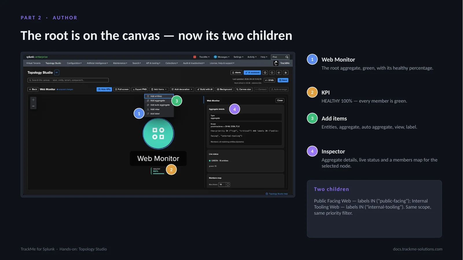
The root aggregate Web Monitor (callout 1) sits on the canvas, green, with its healthy percentage. Its KPI (callout 2) reads HEALTHY 100%: every member is green. Add items (callout 3) offers entities, aggregate, auto aggregate, view and label. The Inspector (callout 4) shows aggregate details, live status and a members map for the selected node.
Two children are added with Add items → Add aggregate: Public Facing Web with labels IN (“public-facing”) and Internal Tooling Web with labels IN (“internal-tooling”), each with the same scope and priority filter as the root and its own label. On the children, automatic members are switched on.
Automatic members, KPIs and sparklines
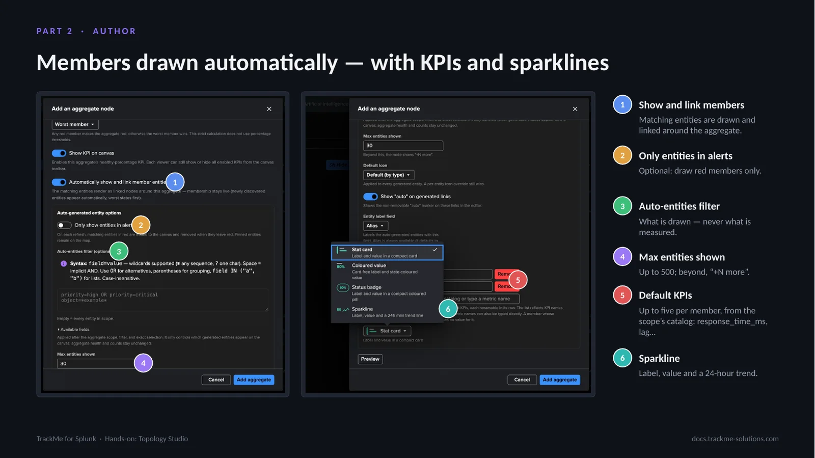
Show and link members (callout 1) draws the matching entities around the aggregate and links them; membership stays live, worst states first. Only entities in alerts (callout 2) draws red members only and removes them when they recover. The Auto-entities filter (callout 3) decides what is drawn, never what is measured. Max entities shown (callout 4) goes up to 500; beyond that the node shows “+N more”. Default KPIs (callout 5) allows up to five per member from the scope’s catalog, here response_time_ms for the heartbeat checks and lag for the log feeds. The Sparkline style (callout 6) shows label, value and a 24-hour trend on every member.
Linking, arranging and saving
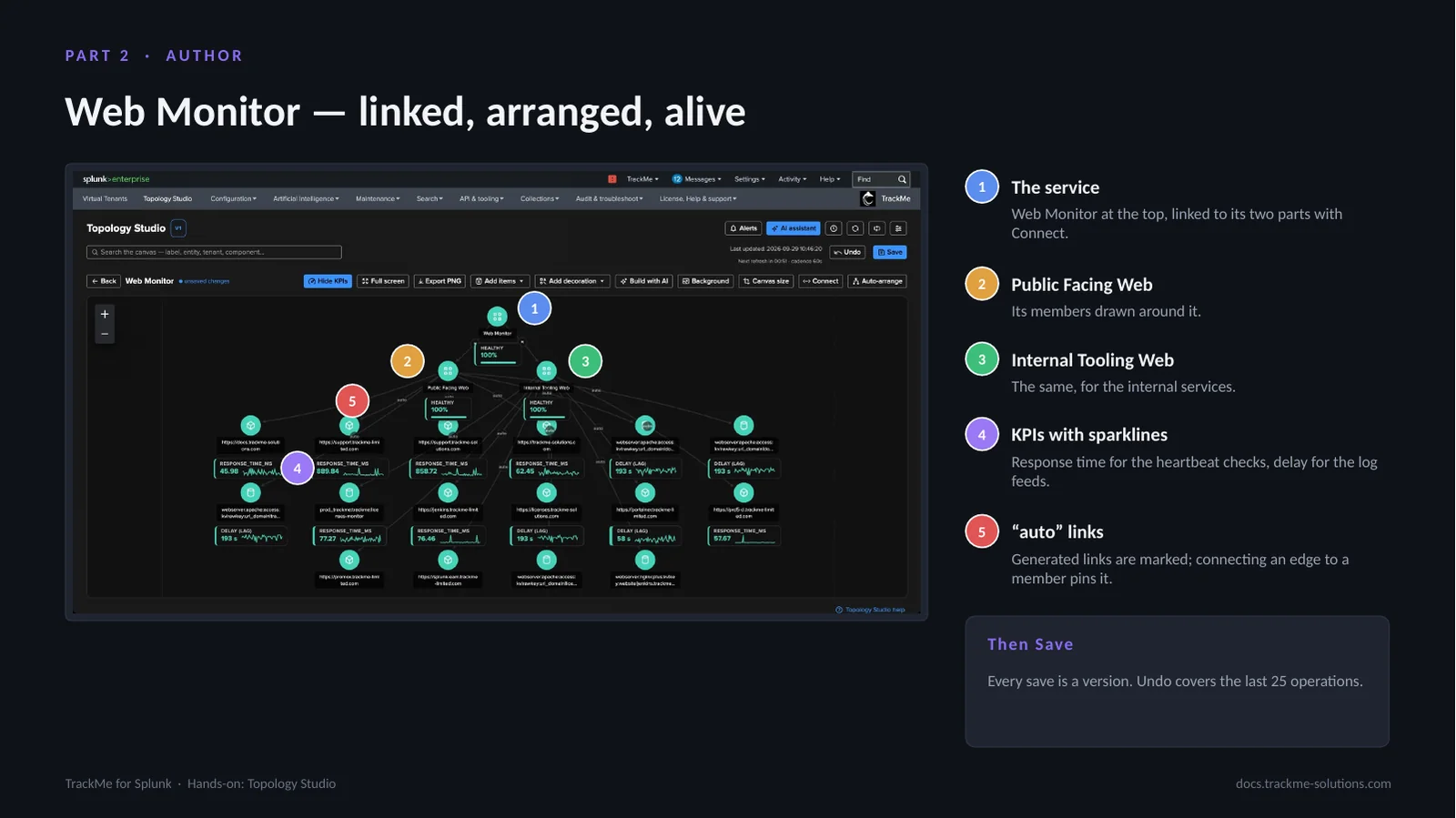
Web Monitor (callout 1) sits at the top, linked to its two parts with Connect: toggle it, click the source, then the target. Public Facing Web (callout 2) and Internal Tooling Web (callout 3) each have their members drawn around them. KPIs with sparklines (callout 4) show response time for the heartbeat checks and delay for the log feeds, with a 24-hour trend. Generated links are marked “auto” (callout 5); connecting an edge to a member pins it. Auto-arrange lays out the tree.
Nothing is stored until Save is clicked; every save becomes a version that can be restored, and Undo covers the last 25 operations.
Inspecting a member node
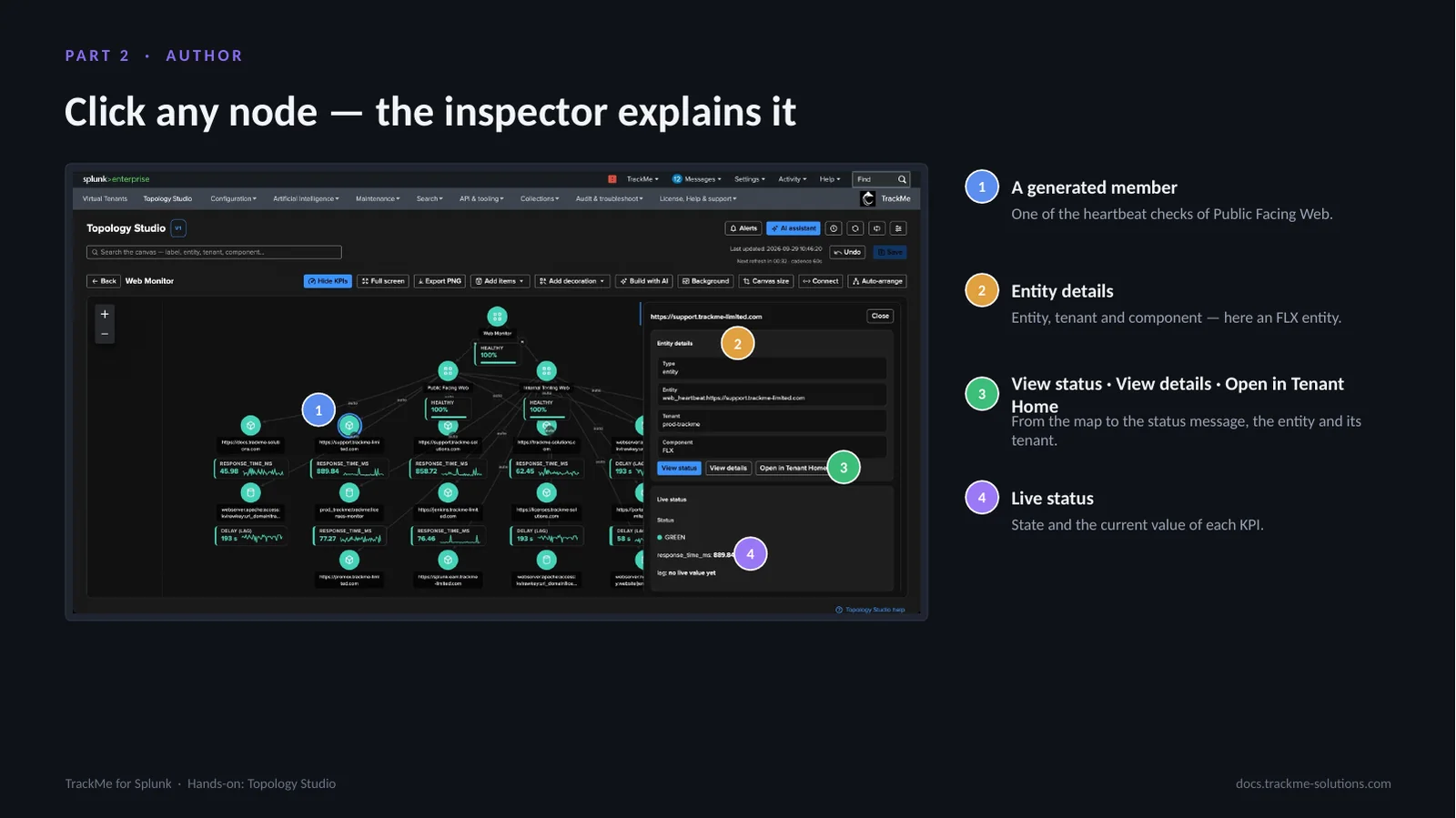
Selecting a generated member (callout 1), one of the heartbeat checks of Public Facing Web, opens the inspector. Entity details (callout 2) give the entity, tenant and component, here an FLX entity. View status, View details and Open in Tenant Home (callout 3) lead from the map to the status message, the entity and its tenant. Live status (callout 4) shows the state and the current value of each KPI.
The inspector is where the map becomes operational: the status is the same status message and score breakdown as in Tenant Home, and the entity can be opened directly in its tenant.
Part 3 — Alert
A map worth watching is a map worth alerting on. A Topology Alert is attached to a view, evaluates the nodes of that view on a schedule and notifies on transitions only: open, update and resolve. It speaks only when the set of unhealthy items changes, and the email carries the rendered map.
Creating a Topology Alert
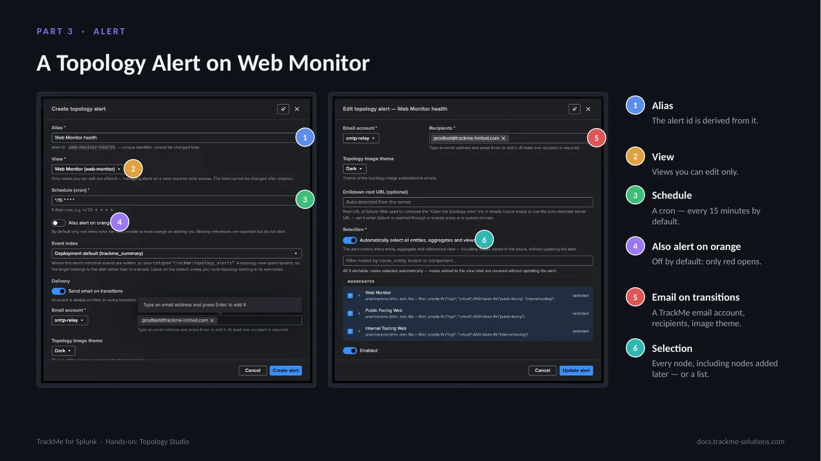
From the Alerts button in the view header, New alert opens the alert form. Alias (callout 1): the alert id is derived from it. View (callout 2) lists only views the user can edit. Schedule (callout 3) is a cron, every 15 minutes by default. Also alert on orange (callout 4) is off by default, so only red opens an alert. Email on transitions (callout 5) takes a TrackMe email account, recipients and an image theme, dark or light, with the rendered topology embedded. Selection (callout 6) covers every entity, aggregate and referenced view of the map, including nodes added later, or an explicit list.
Every run writes a trackme:topology_alerts event on each transition; email is an extra channel.
Alert list and run history
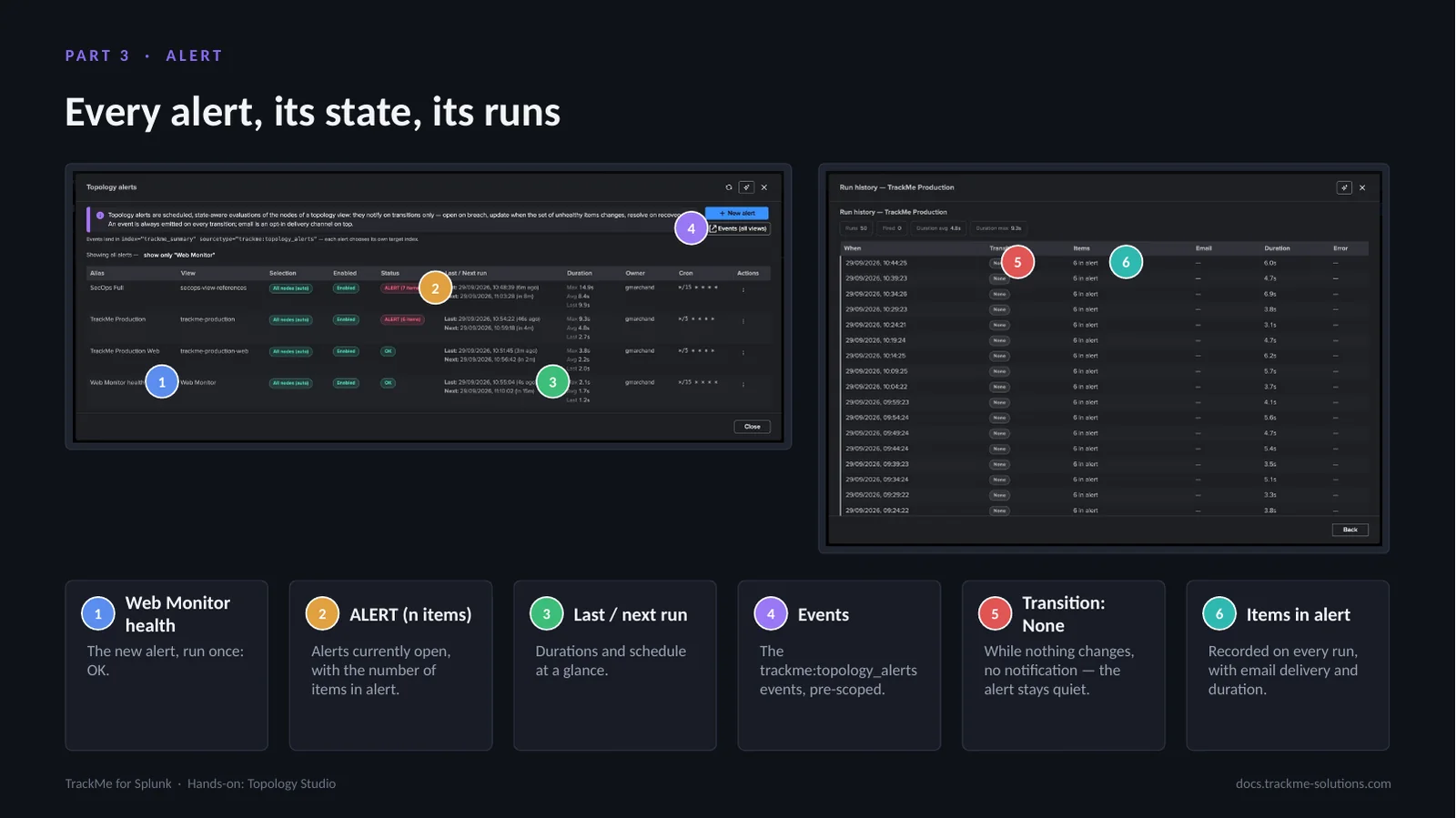
The alerts list covers every view. Web Monitor health (callout 1) is the new alert, run once: OK. ALERT (n items) (callout 2) marks alerts currently open with the number of items in alert; here two alerts are open, one with seven items. Last / next run (callout 3) shows durations and schedule. Events (callout 4) opens the trackme:topology_alerts events, pre-scoped. Transition: None (callout 5) is the key property of an open alert: while the set of affected items does not change, no notification is sent. Items in alert (callout 6) is recorded on every run, with email delivery and duration.
Row actions include Run now, Alert events, Logs, History and Ask AI.
The alert-opened email
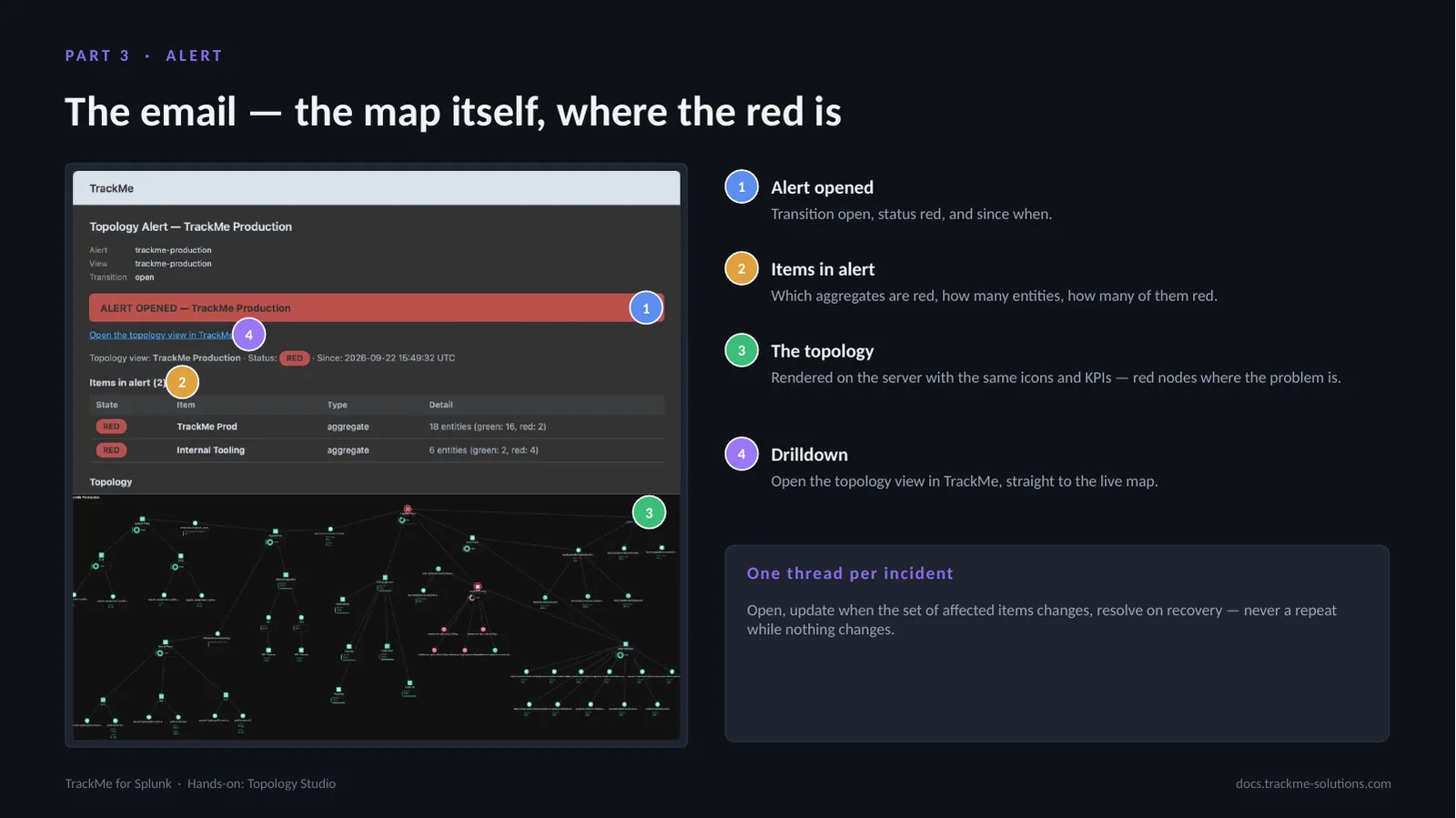
The email of a Topology Alert on the TrackMe Production view. Alert opened (callout 1) states the transition open, the status red and since when. Items in alert (callout 2) lists which aggregates are red, how many entities they hold and how many of those are red; when this alert opened, two aggregates were red. The topology (callout 3) is rendered on the server with the same icons and KPIs as the canvas, red nodes where the problem is. Drilldown (callout 4) opens the topology view in TrackMe, straight to the live map.
Each incident is one thread: open, update when the set of affected items changes, resolve on recovery, never a repeat while nothing changes.
The resolution email
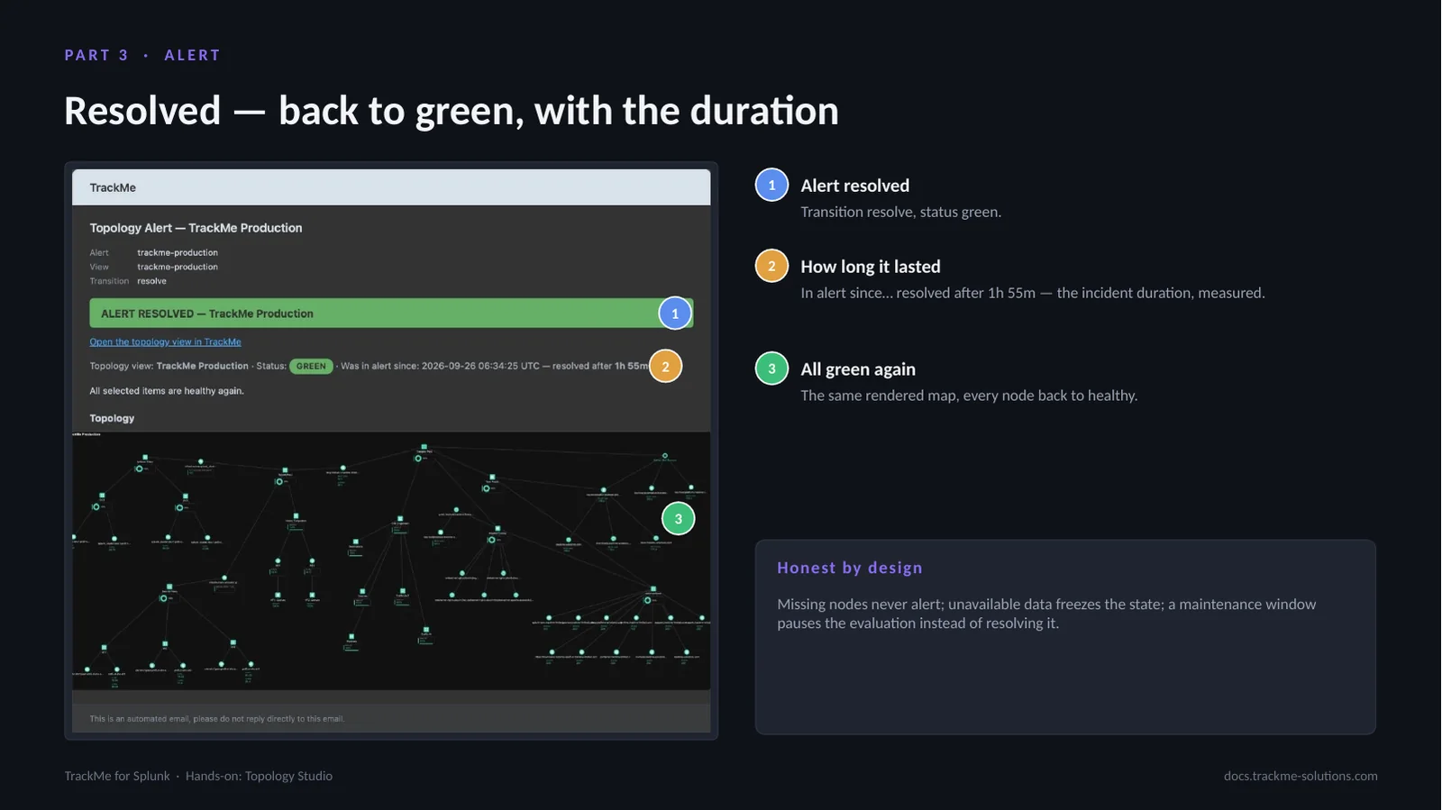
The resolution email of the same alert. Alert resolved (callout 1) states the transition resolve and the status green. How long it lasted (callout 2) reads “in alert since… resolved after 1h 55m”, the measured incident duration. All green again (callout 3) is the same rendered map with every node back to healthy.
The alert state is honest by design: missing nodes never alert, unavailable data freezes the state, and a maintenance window pauses the evaluation instead of resolving it. An alert is never resolved by a data gap or a maintenance window.
The live view during an alert
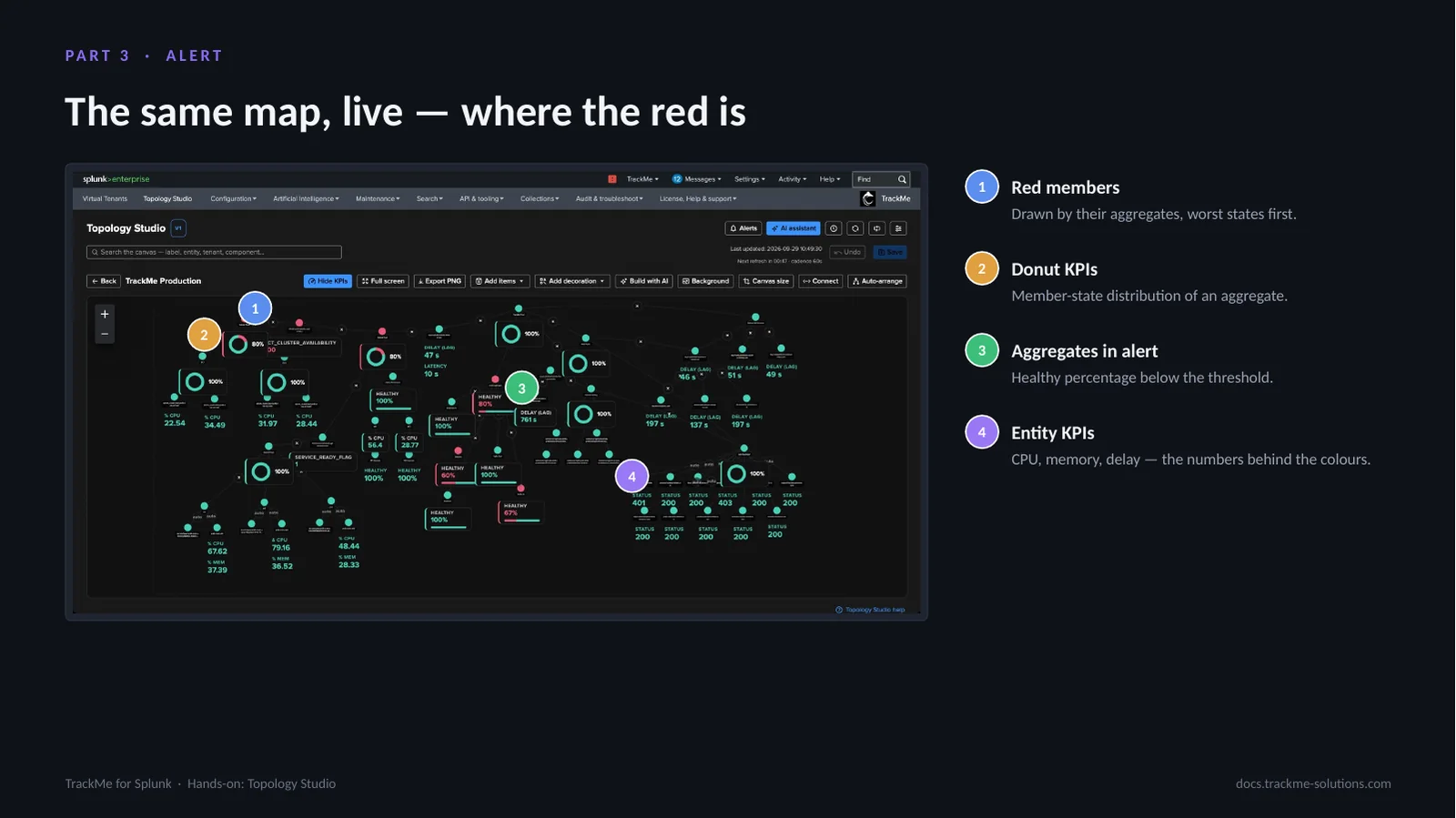
The TrackMe Production view while its alert is open: thirty-five nodes over several tenants and components. Red members (callout 1) are drawn by their aggregates, worst states first. Donut KPIs (callout 2) show the member-state distribution of an aggregate. Aggregates in alert (callout 3) have a healthy percentage below the threshold. Entity KPIs (callout 4), CPU, memory and delay, are the numbers behind the colours.
The red is where the email placed it: the live map and the email tell the same story because they are the same map.
Part 4 — AI

Build with AI turns a sentence into a live draft on a preview canvas. A dedicated AI builder agent reads the inventory of the selected tenants and proposes a draft, compiled and validated like a manual save. The draft is refined in plain words and then created as a view; nothing is saved until that point.
Prompt, tenants and provider
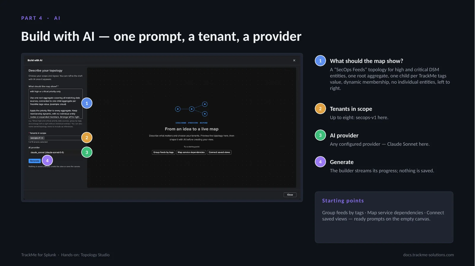
The prompt (callout 1) asks for a “SecOps Feeds” topology for high and critical DSM entities: one root aggregate, one child aggregate per TrackMe tags value, the priority filter on every aggregate, dynamic membership, no individual entities, laid out left to right. Tenants in scope (callout 2) accepts up to eight tenants, secops-v1 here. AI provider (callout 3) is any provider configured in TrackMe, Claude Sonnet in this case. Generate (callout 4) starts the builder, which streams its progress; nothing is saved.
The empty canvas offers ready prompts as starting points: Group feeds by tags, Map service dependencies and Connect saved views.
Reading the first draft
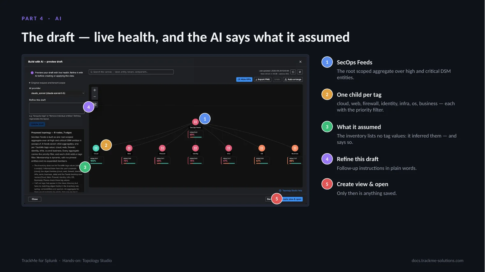
The first draft arrives in about twenty seconds on a live preview canvas with real health. SecOps Feeds (callout 1) is the root scoped aggregate over high and critical DSM entities. One child per tag (callout 2): cloud, web, firewall, identity, infra, os and business, each carrying the priority filter. What it assumed (callout 3): the inventory the builder receives carries priorities and labels but no tag values, so it inferred them from the data source families, left out three tags it could not confirm, and says so in its summary. Refine this draft (callout 4) takes follow-up instructions in plain words. Create view & open (callout 5) is the only step that saves anything.
Refining the draft
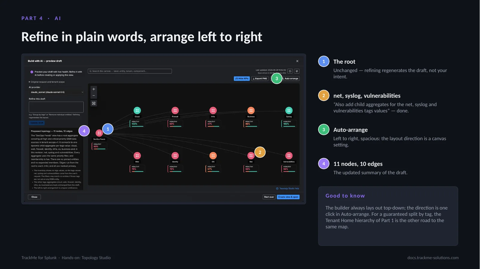
One refinement adds the missing tags: “Also add child aggregates for the net, syslog and vulnerabilities tags values”. The root (callout 1) is unchanged, because refining regenerates the draft, not the intent. The three new children (callout 2) appear; the draft updates in place, and a failed refinement would keep the previous draft. Auto-arrange (callout 3) switches the layout to left to right, spacious: the builder always lays out top-down, and the direction is a canvas setting, one click away. The summary (callout 4) now reads 11 nodes, 10 edges.
For a guaranteed split by tag, the Tenant Home hierarchy of Part 1 produces the same map: two roads to the same destination.
The created view
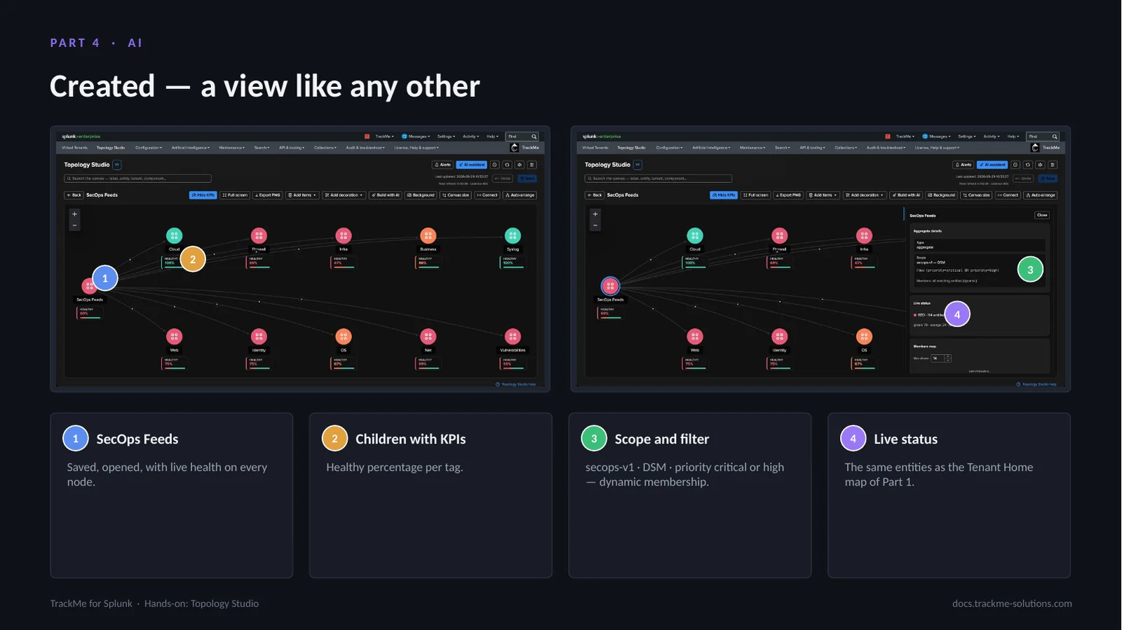
Create view & open saves the draft as a regular view: editable, versioned, shareable and alertable. SecOps Feeds (callout 1) is saved and opened, with live health on every node. Children with KPIs (callout 2) show the healthy percentage per tag. Scope and filter (callout 3) in the root’s inspector read secops-v1 · DSM · priority critical or high, with dynamic membership, exactly as the AI wrote them. Live status (callout 4) covers the same entities as the Tenant Home map of Part 1.
In production
Three maps run every day on the deployment the screens were captured from: a Cribl pipeline mapped from sources to destinations, a public web estate with screenshots as decorations, and a map of maps over the Splunk infrastructure, with a drilldown from the top view to the reason for a red node.
A Cribl Stream pipeline map
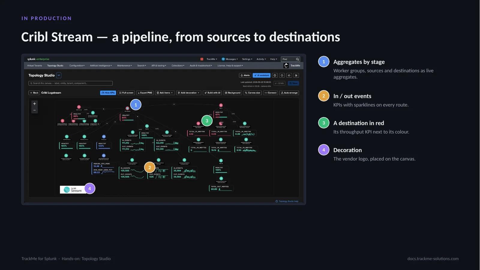
A Cribl Stream pipeline mapped from TrackMe entities. Aggregates by stage (callout 1) represent worker groups, sources and destinations as live aggregates. In / out events (callout 2) are KPIs with sparklines on every route. A destination in red (callout 3) shows its throughput KPI next to its colour. The decoration (callout 4) is the vendor logo, placed on the canvas. With events in and out and throughput as KPIs, the map reads like the pipeline itself.
Decorations on a web estate map
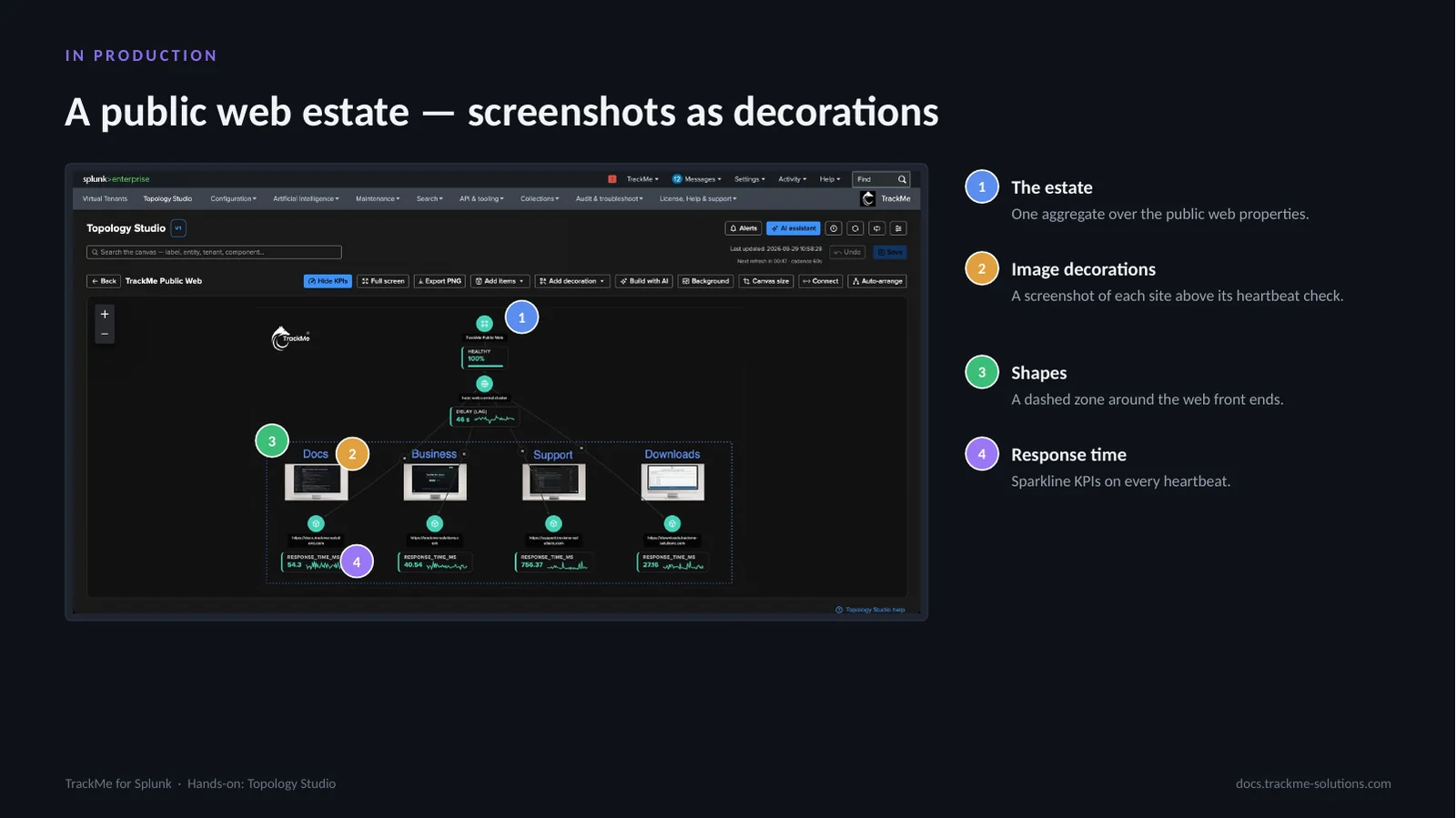
The estate (callout 1) is one aggregate over the public web properties. Image decorations (callout 2) place a screenshot of each site above its heartbeat check. Shapes (callout 3) draw a dashed zone around the web front ends. Response time (callout 4) is a sparkline KPI on every heartbeat.
Decorations turn a map into a picture people recognise. They never affect health, and they appear in PNG exports and in alert emails.
Nesting views: the Splunk infrastructure
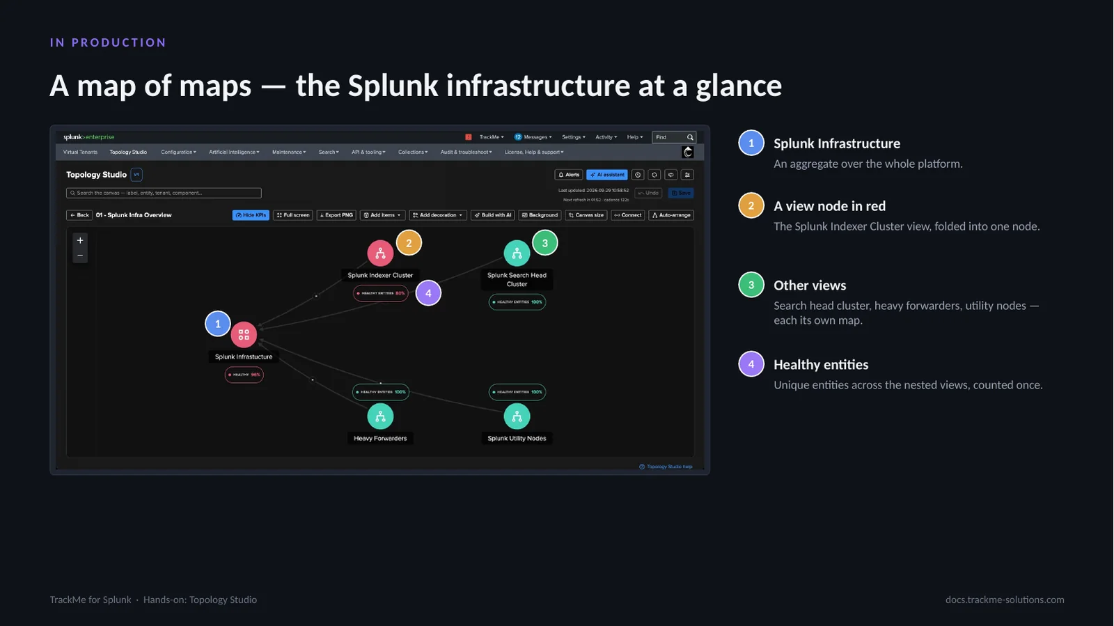
The top view of the Splunk infrastructure. Splunk Infrastructure (callout 1) is an aggregate over the whole platform. A view node in red (callout 2) is the Splunk Indexer Cluster view, folded into one node. Other views (callout 3), search head cluster, heavy forwarders and utility nodes, are each their own map. Healthy entities (callout 4) counts unique entities across the nested views, each counted once.
A view node counts the unique underlying entities across nested views and follows their policies; one of the nested views is red at the time of capture.
Drilling into a view node
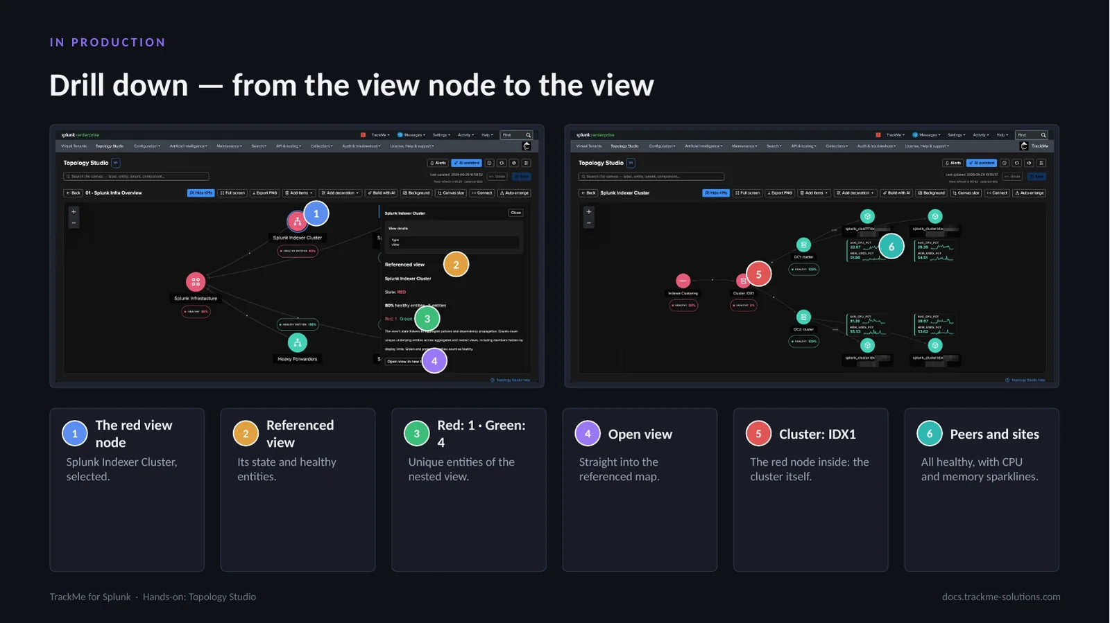
The drilldown starts by selecting the red view node (callout 1), Splunk Indexer Cluster. Referenced view (callout 2) shows its state and healthy entities. Red: 1 · Green: 4 (callout 3) counts the unique entities of the nested view: one red entity out of five. Open view (callout 4) leads straight into the referenced map. Inside, Cluster: IDX1 (callout 5) is the red node, the cluster itself. Peers and sites (callout 6) are all healthy, with CPU and memory sparklines. The red belongs to the cluster entity, not to any peer.
Reading the entity status
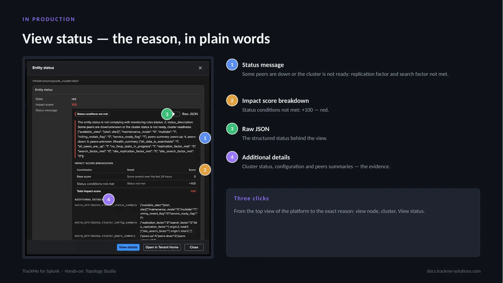
View status on the red member opens the entity status. The Status message (callout 1) reads that some peers are down or the cluster is not ready: replication factor and search factor not met. The Impact score breakdown (callout 2) shows Status conditions not met: +100, which makes the entity red. Raw JSON (callout 3) is the structured status behind the view. Additional details (callout 4) hold the cluster status, configuration and peers summaries, the evidence.
From the top view of the platform to the exact reason takes three clicks: view node, cluster, View status. This is the same status message the alert and the AI Assistant use.
Where we are
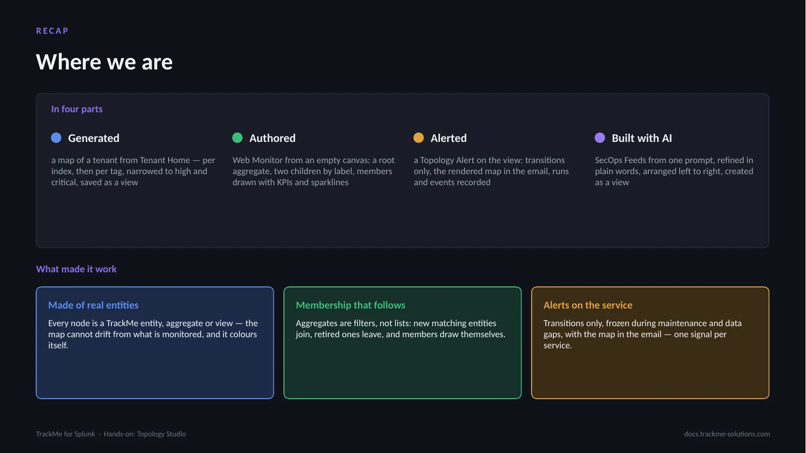
Four ways to a live map. Generated: a map of a tenant from Tenant Home, per index then per tag, narrowed to high and critical. Authored: Web Monitor from an empty canvas, a root aggregate, two children by label, members with KPIs and sparklines. Alerted: a Topology Alert on the view, transitions only, the rendered map in the email. Built with AI: SecOps Feeds from one prompt, refined in plain words.
What made it work: maps are made of real entities, aggregates or views, so they cannot drift from what is monitored. Aggregates are filters, not lists: matching entities join, retired ones leave. Alerts fire on transitions only, frozen during maintenance and data gaps: one signal per service.