End-to-end example — monitoring a production Web platform
This chapter builds a complete, production-grade topology from scratch — the exact workflow, screen by screen. The scenario is the monitoring of TrackMe’s own Web platform, articulated around two sides:
Public Facing — the websites customers reach: the main site, documentation, support portals, license services.
Internal Tooling — the engineering-facing services behind them: CI, container management, virtualization, internal Splunk services.
Each side is observed from two angles, correlated on one canvas:
Active monitoring — synthetic Web heartbeats (FLX entities) probing every URL: HTTP status, response time.
Trace logging — the webserver access logs (DSM entities) and the hosts shipping them (DHM entities): event delay, lag, host activity.
By the end of the chapter the topology detects a real incident, opens an alert, sends lifecycle emails with the rendered map embedded, and resolves itself when the platform recovers. Every capability used here is described in depth in Authoring topologies and Topology Alerts — this page is the story of using them together.
Step 1 — Create the view
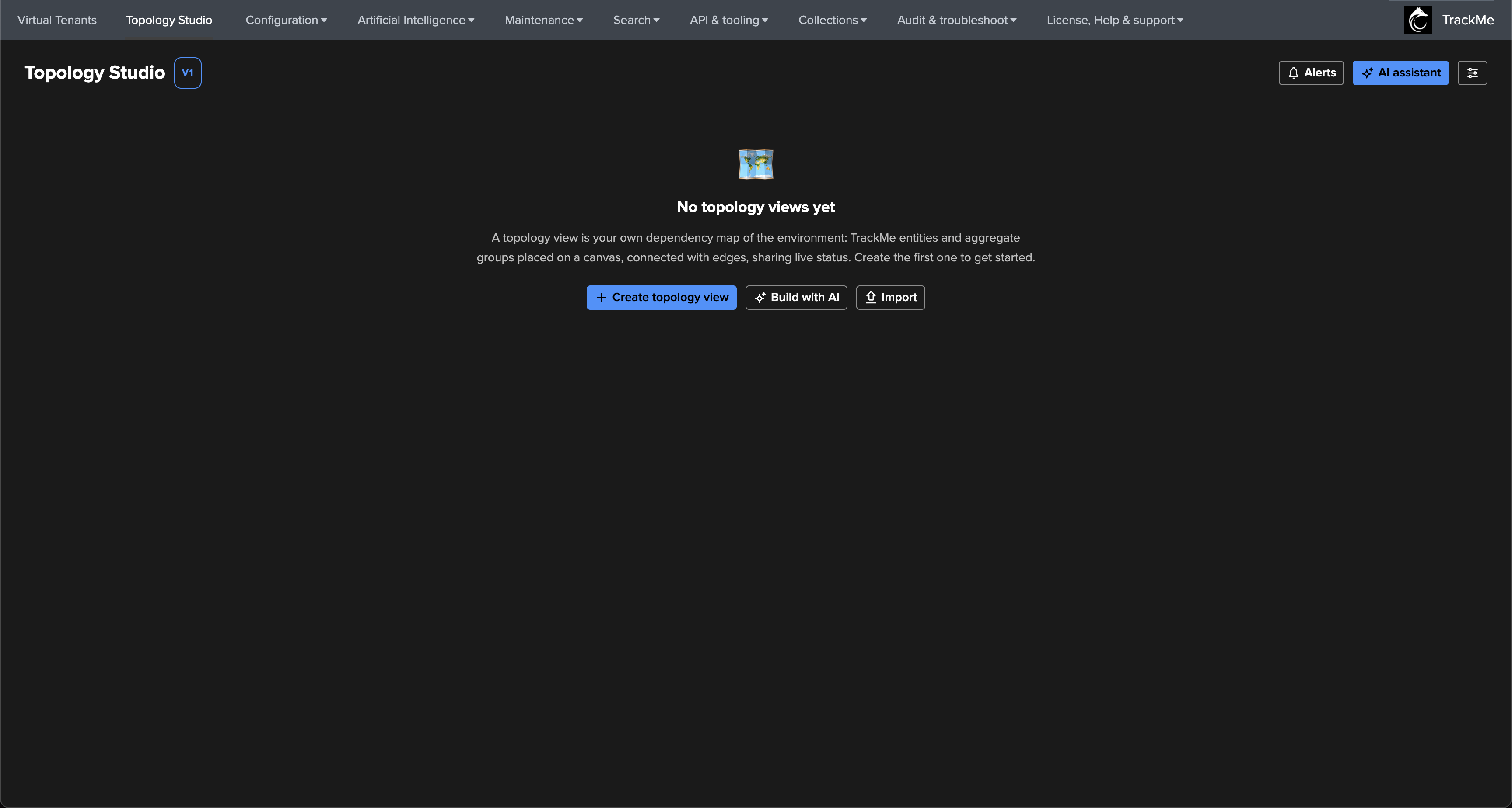
Open Topology Studio from the main navigation. On a fresh installation the landing page offers to create the first view, to have the AI Builder draft one from a plain-language description, or to import one:
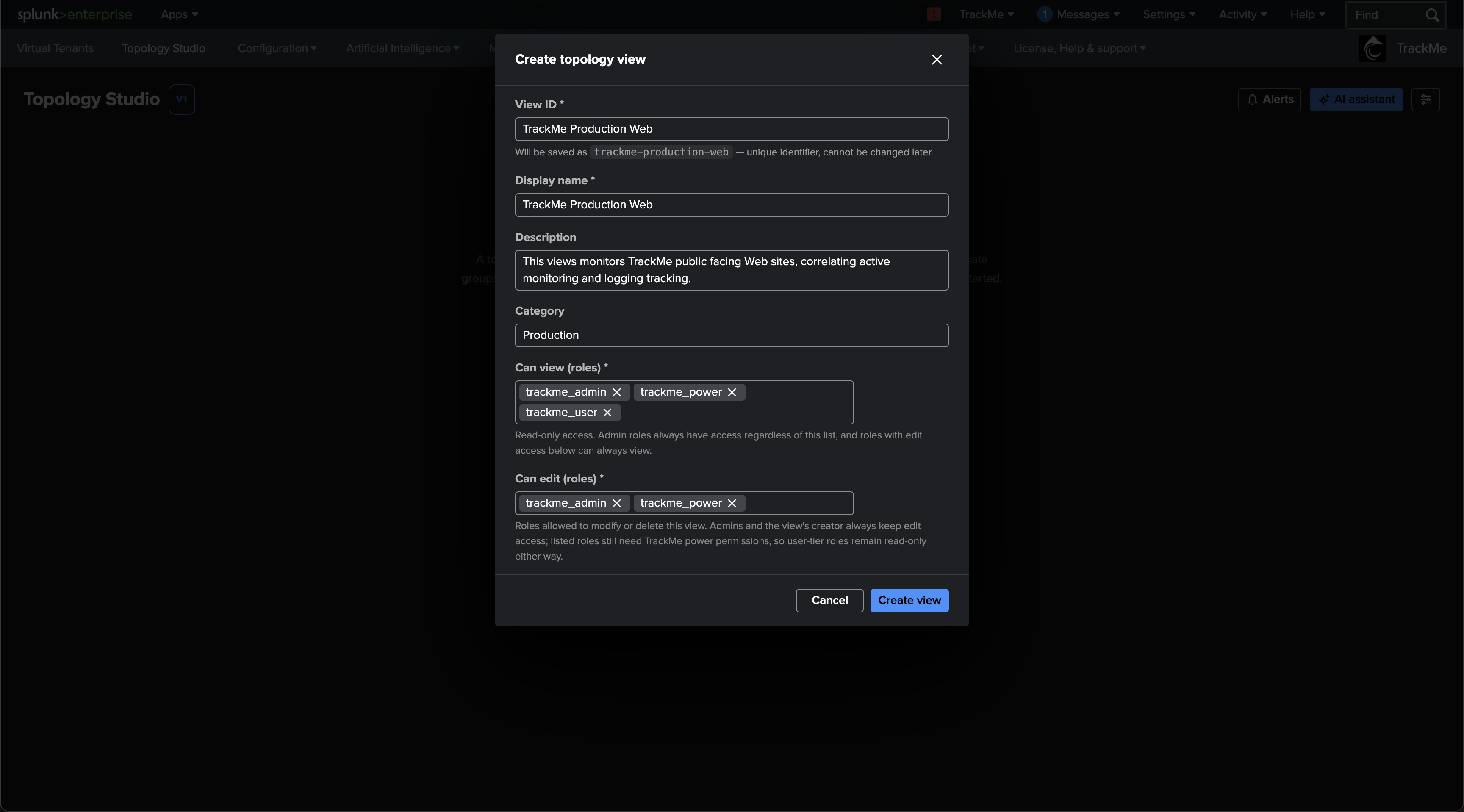
Click Create topology view and describe the view: a view ID (the immutable
view_id is derived from what you type and cannot be changed later), a display name,
a description, a category — views sharing a category
are grouped on the landing page, and can be filtered from the
views browser — and the RBAC contract: which roles
can view and which roles can edit.

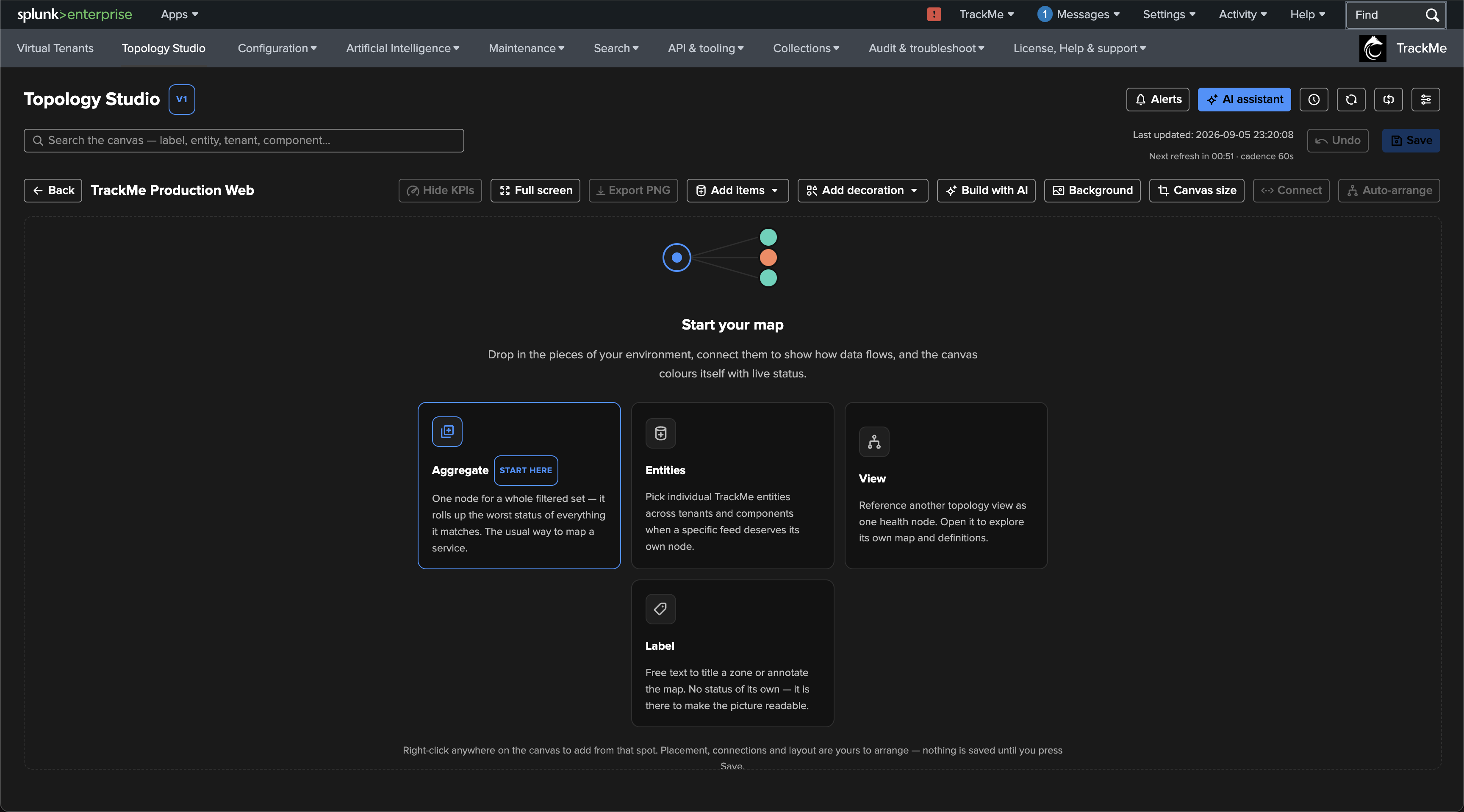
The new view opens on an empty canvas. The Start your map helper summarises the node types — for a service map like this one, aggregates are the natural starting point:
Step 2 — The root aggregate
Tip
This example uses a scoped root aggregate with its own selection and health policy. Since TrackMe 2.4.18, an auto aggregate is another option when the root should derive its health entirely from connected children. Follow that guide for child-to-parent connections; the scoped-root workflow below remains valid.
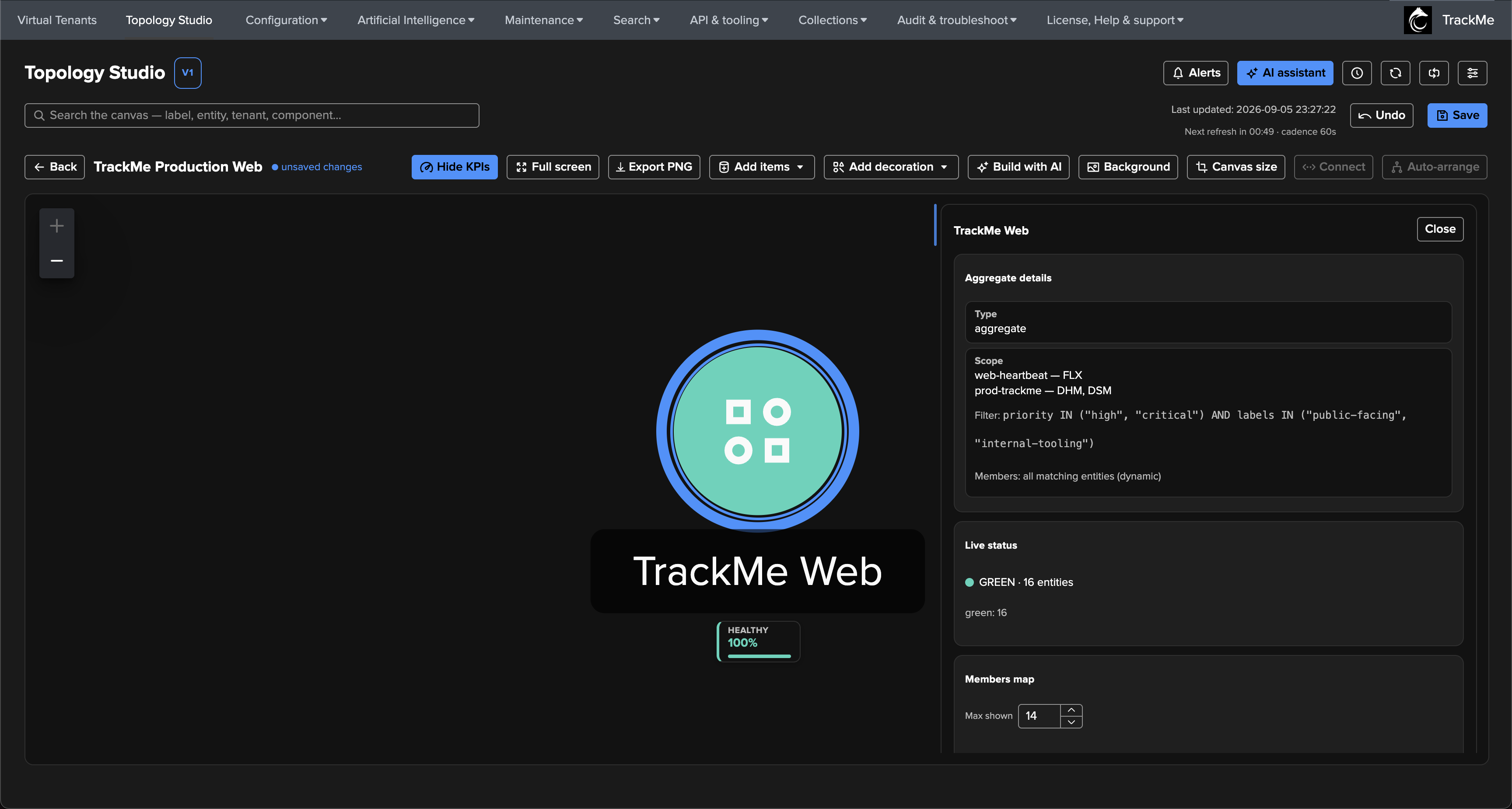
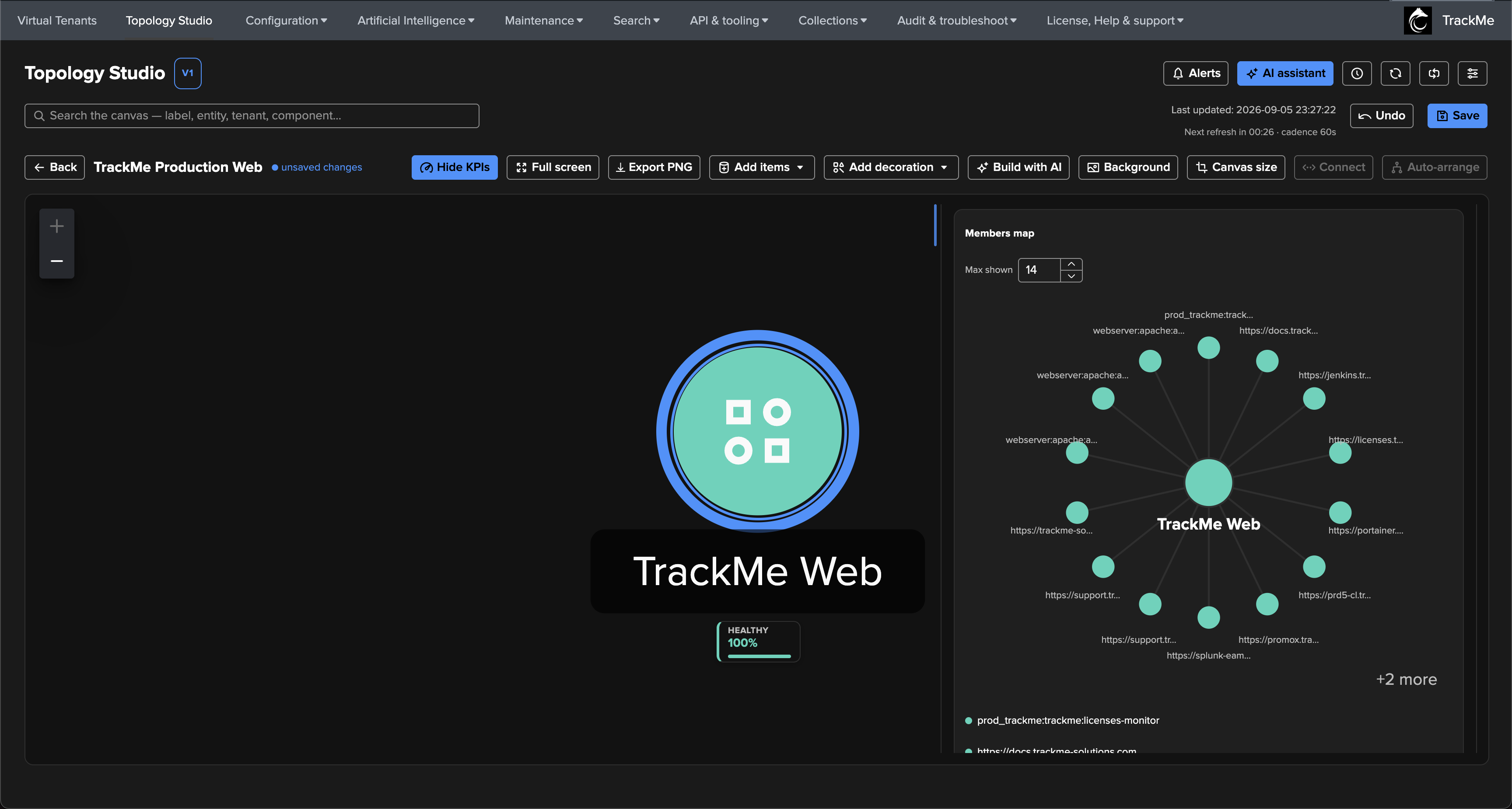
The first node is the root of the map: one aggregate called TrackMe Web covering everything the platform depends on. Its scope spans two tenants — the Web-heartbeat tenant (FLX synthetic checks) and the production tenant (DSM data sources and DHM hosts) — and a filter narrows the membership to what matters here, combining the priority and the labels that classify the two sides:
priority IN ("high", "critical") AND labels IN ("public-facing", "internal-tooling")


Two health calculations are available. Worst member is strict — any red member makes the aggregate red. Healthy percentage classifies the healthy ratio through configurable bands — drag the two boundaries to decide how much of the 0–100% scale is red, orange, or green. The root node uses healthy percentage, so a single degraded URL does not paint the whole platform red:

Add the aggregate: the node lands on the canvas, already live — the inspector shows the resolved scope, the filter, the live status (16 entities, all green) and, further down, a members map of the matching entities around the aggregate:
Step 3 — Branding the node with a custom icon
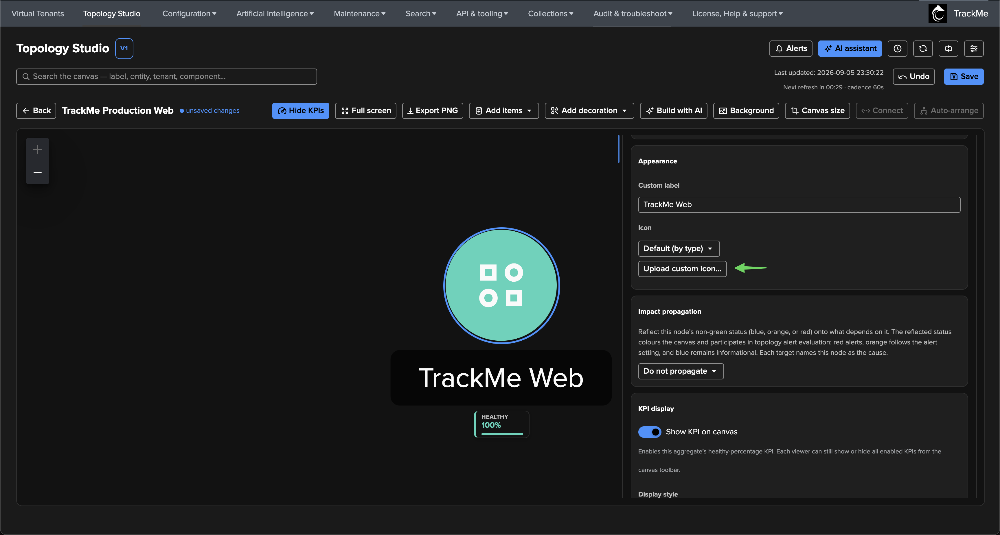
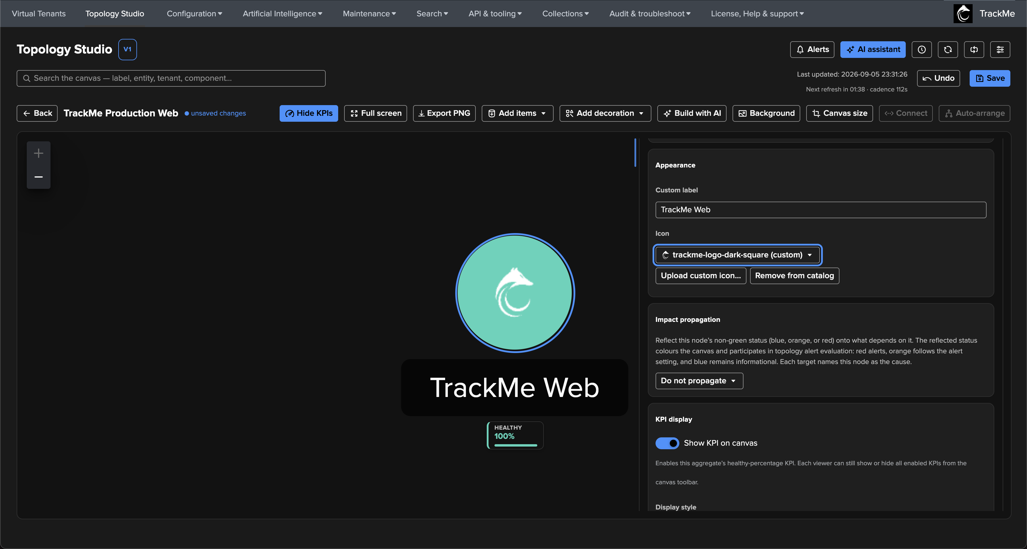
Right-click any node for its context menu — inspect, rename, change icon, update the scope in place, connect from here, or remove. Change icon scrolls the inspector to the appearance section, where the icon catalog is available and custom icons can be uploaded (they are normalised client-side and stored with the deployment, so every viewer sees them):
Step 4 — The two sides: Public Facing and Internal Tooling
The second layer splits the platform into its two sides. Each side is an aggregate scoped to the production tenant (DSM, DHM and FLX) whose filter selects one label — first Public Facing Web:
priority IN ("high", "critical") AND labels IN ("public-facing")

Step 5 — Connecting the map
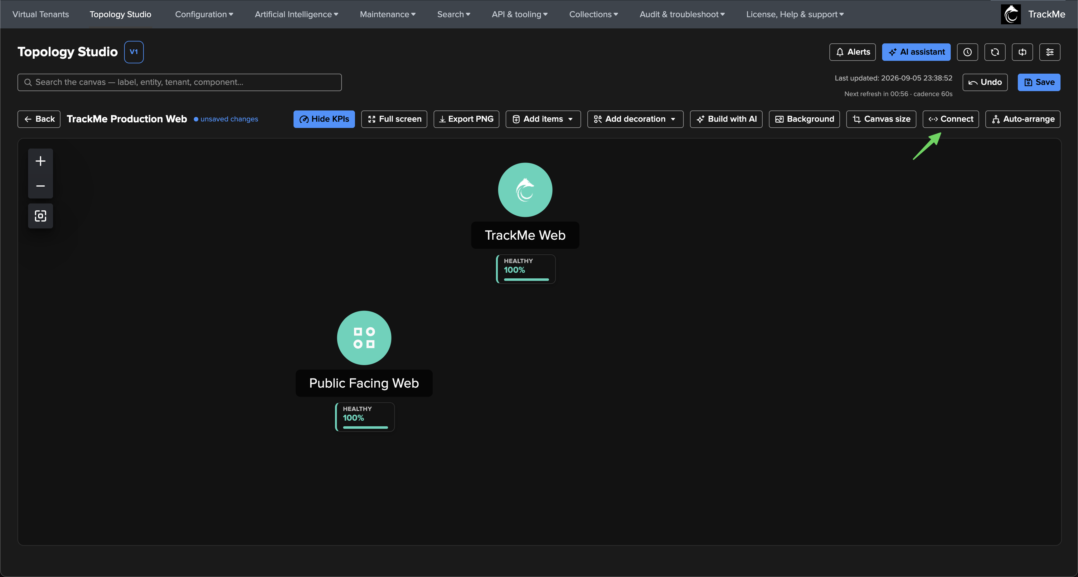
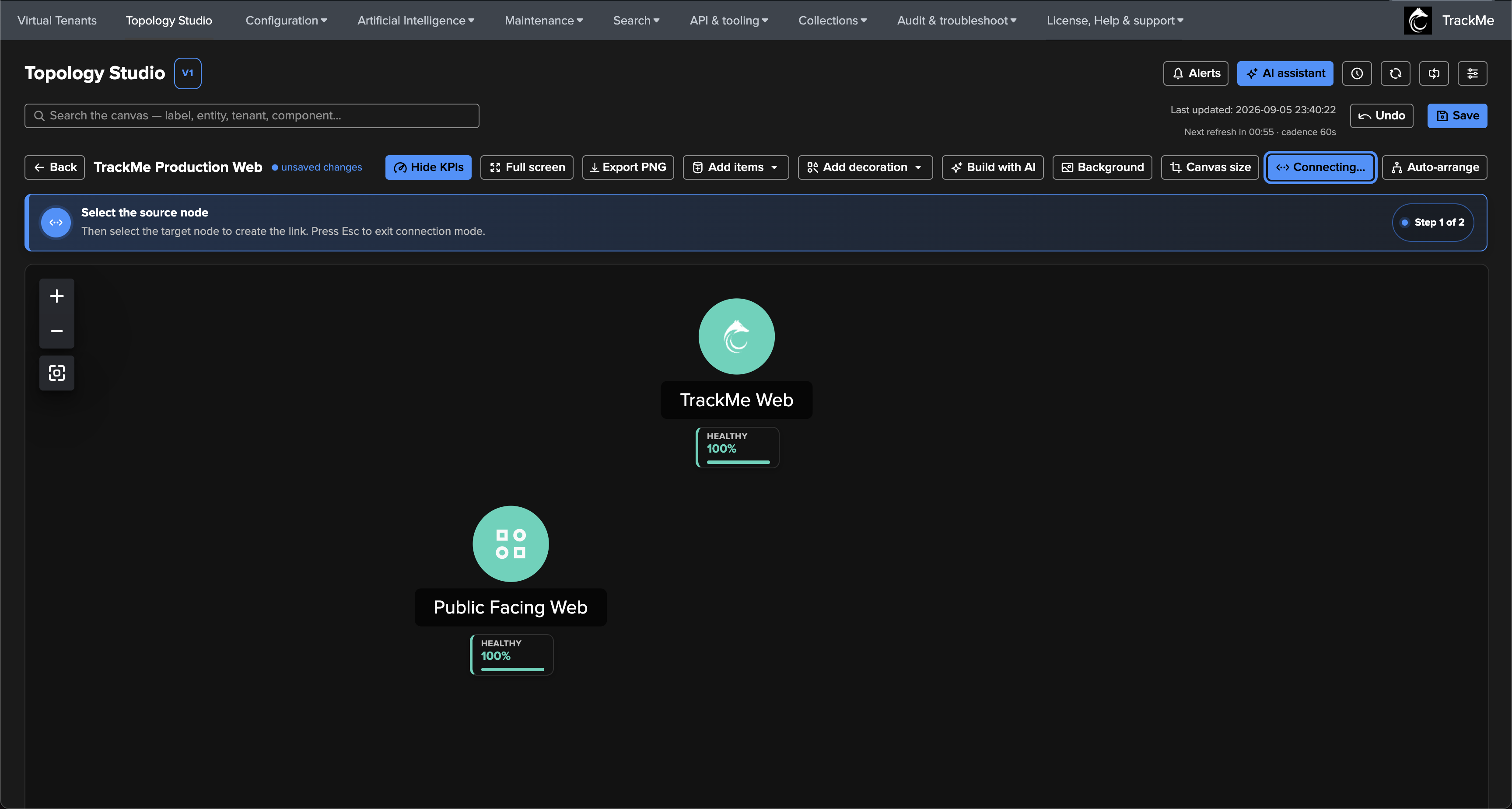
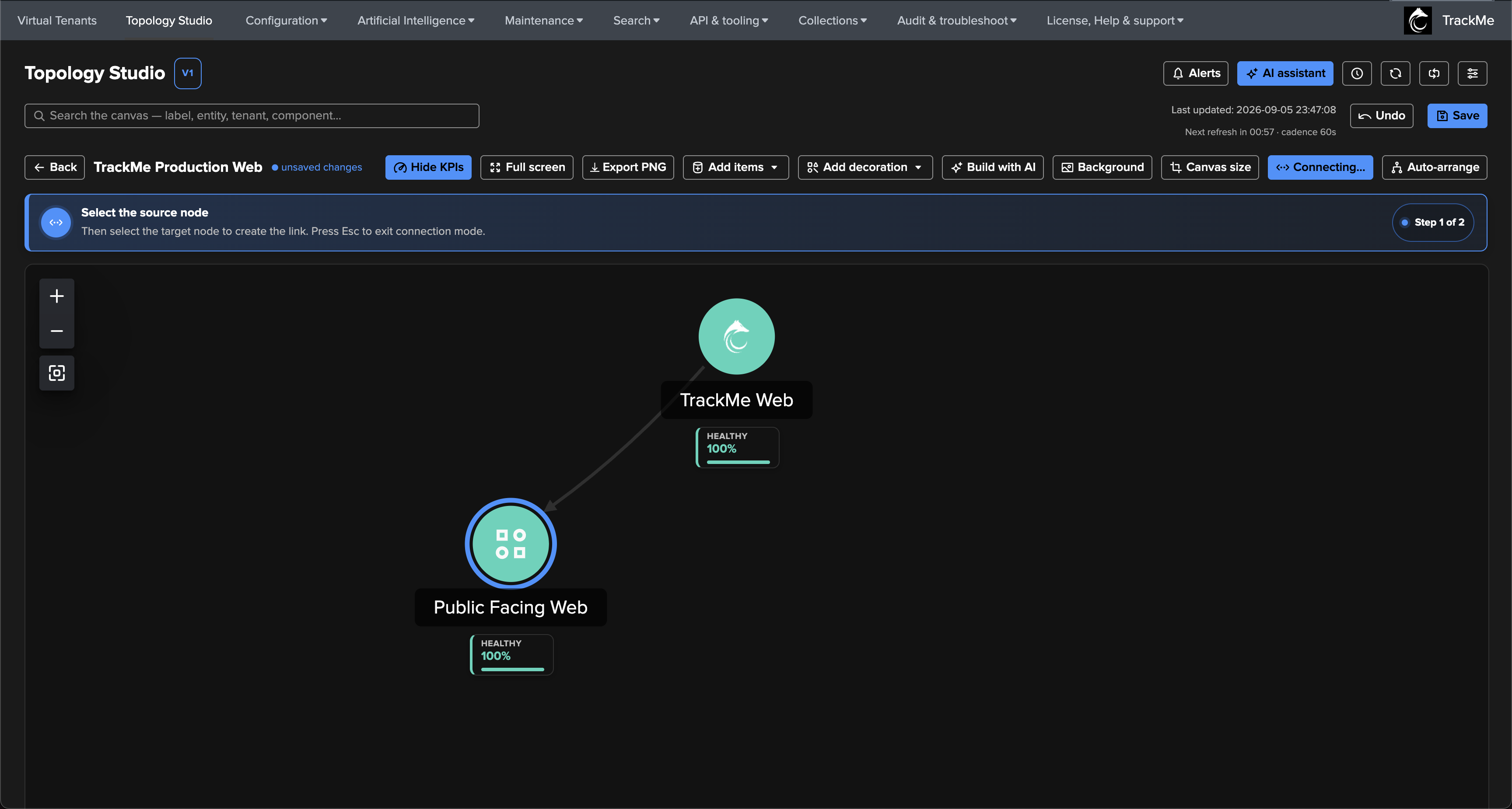
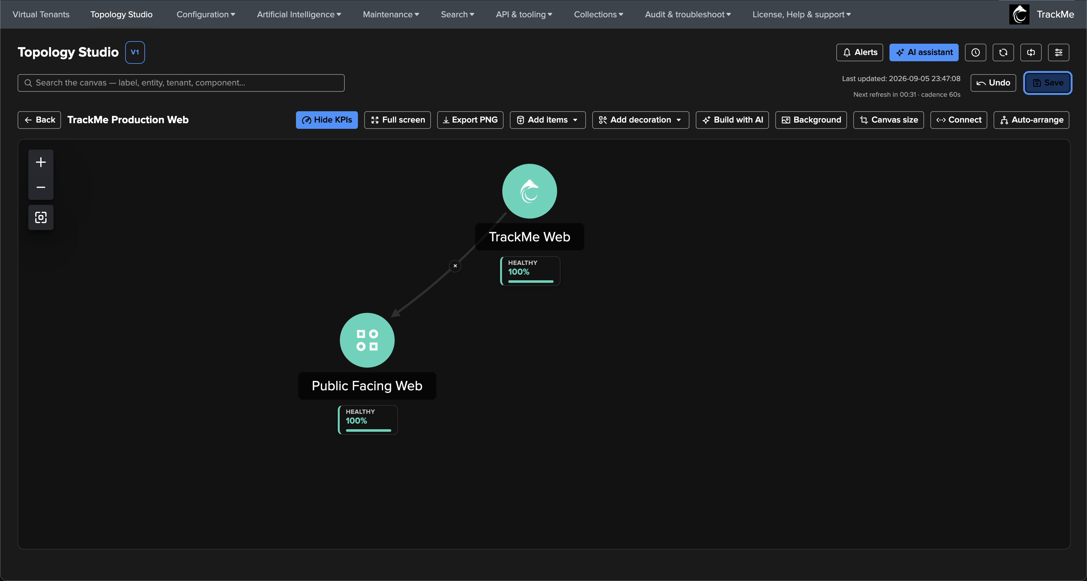
With two nodes on the canvas, enable Connect mode: click the source node, then the target node — the directed edge materialises immediately. Press Esc, click Connecting…, or simply save to leave the mode:
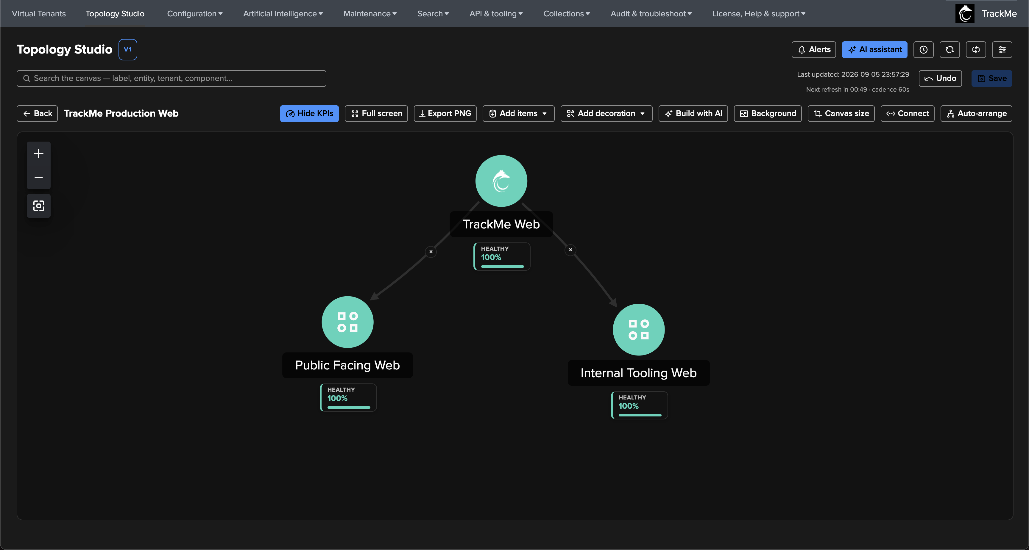
Repeat for the second side — Internal Tooling Web, same scope, filter on the
internal-tooling label — and connect it under the root. The hierarchy takes
shape:

Step 6 — Bulk selection and alignment
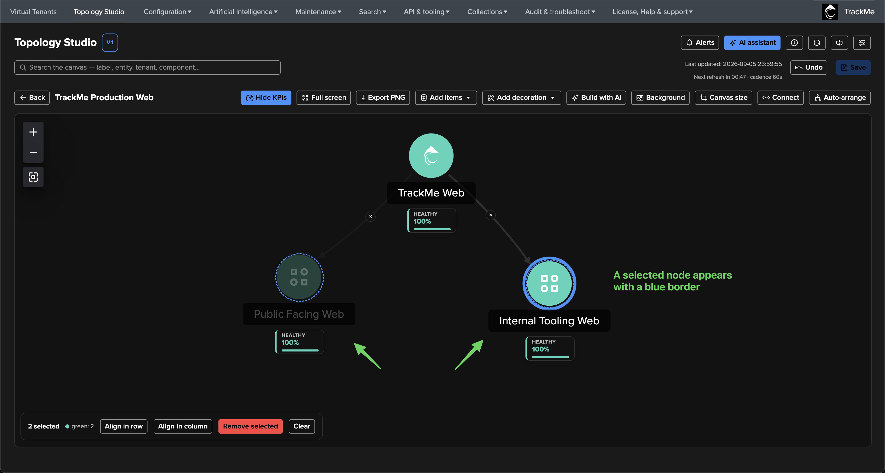
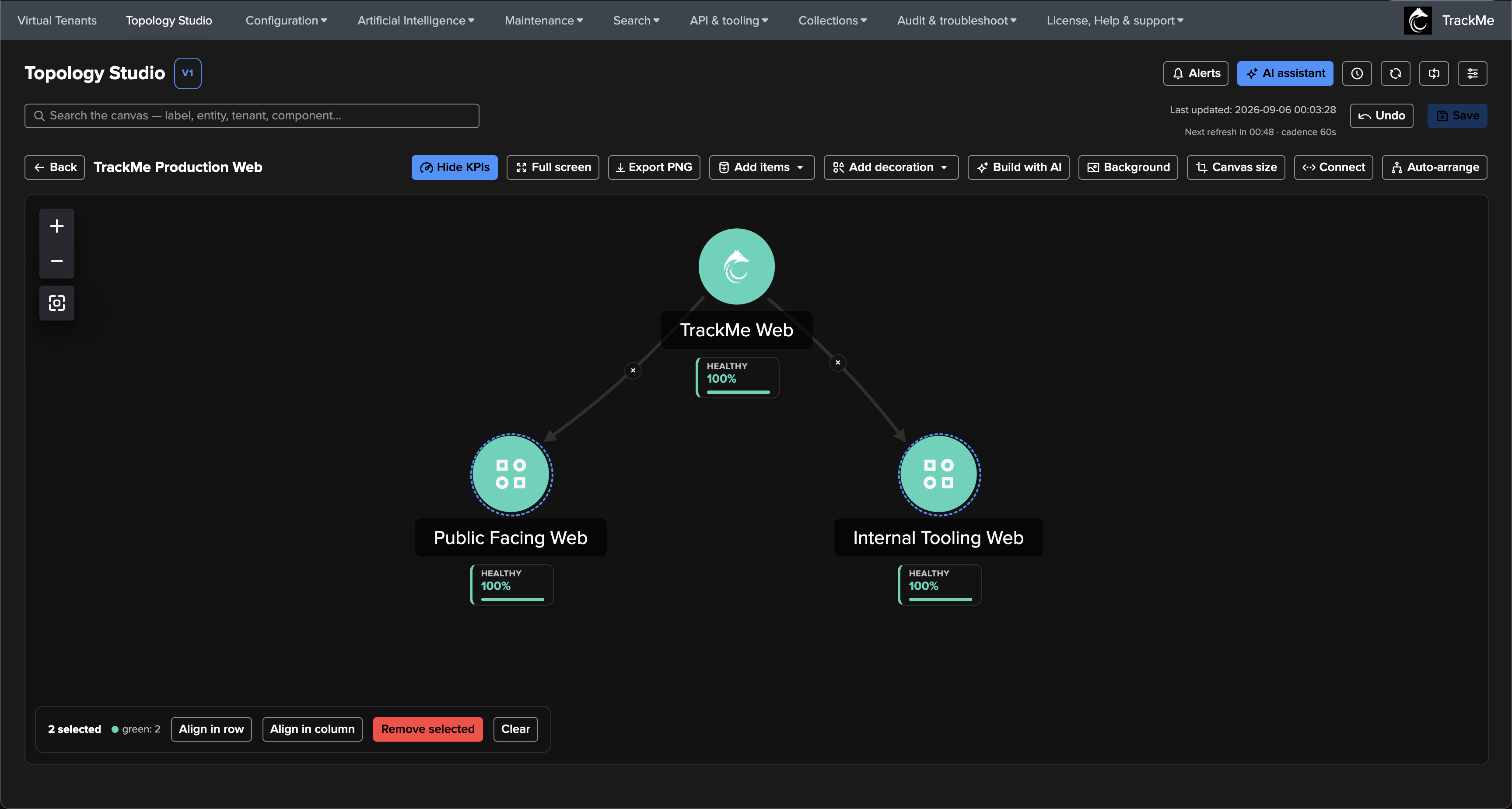
Hold Command (macOS) or Control (Windows/Linux) and click nodes to build a multi-selection — selected nodes carry a dashed blue ring, and the bulk actions bar appears: align in row, align in column, remove, clear. Aligning the two sides on one row keeps the layers visually clean:
Tip
Bulk selection covers auto-generated member entities too (see the next step) — group-drag, alignment and the shared actions apply to them exactly as to regular nodes.
Step 7 — Auto-generated member entities
So far every node is an aggregate. The next layer shows the individual URLs being probed — without placing them one by one. The Public Facing Web Heartbeat aggregate scopes the FLX component only and filters on the heartbeat entities of the public side:
object=web_heartbeat* AND priority IN ("high", "critical") AND labels IN ("public-facing")

Then enable Automatically show and link member entities: every entity matched by the aggregate renders as a linked node around it — membership stays live, so URLs added to the monitoring later appear on the map automatically, worst states first. The expansion is configurable:
Auto-entities filter — an optional second filter that chooses which members are drawn, without changing what the aggregate measures.
Max entities shown — beyond the cap (up to 500) the aggregate shows +N more.
Default icon and the “auto” marker on generated links — one icon for every member, and whether the links show their non-removable auto tag.
Entity label field — label the auto-generated entities with the alias (default, always available) or the raw object name; a per-entity rename always wins.
Default KPIs on member nodes — up to five stacked KPIs applied to every member, picked from the scope’s catalog or typed as dynamic metric names, each renamable inline (
http_statusbecomes status,response_time_msbecomes resp ms), with a shared display format (stat card, coloured value, badge, sparkline).


Preview resolves the scope and filter live before anything is added — here the four public URLs, all green:


Repeat the pattern for the remaining branches — Public Facing Web Logging (DSM webserver access sources, delay/lag KPI), Internal Facing Web Logging, and Internal Tooling Web Heartbeat. Each branch correlates one side’s active monitoring with its trace logging, and the map builds itself:

Note
Notice the 401 and 403 status values on some internal URLs — for
authenticated services an unauthenticated probe legitimately answers 401/403, and
the FLX use case treats those as the expected status. The topology shows the
value; the entity’s own thresholds decide what is healthy.
Step 8 — Adding individual entities
Specific entities can also be placed individually — here the DHM hosts shipping the webserver logs, so host-level activity is visible at the very top of the map. Add entities opens the cross-tenant picker: choose a tenant and a component, filter, select, and add:


Connect the hosts to the side they serve, and the design is complete:

Step 9 — Reading the map
Everything on the canvas is inspectable. Selecting an entity shows its live status, anomaly reason, and 24-hour metric sparklines (event latency, delay, volume, ML outliers, state events). Selecting an aggregate shows the state distribution and an interactive members map — click a member dot to preview it, then jump to its node or open it:


Entity details opens the same rich modal used across TrackMe — full status message, charts, and a jump to the entity’s Tenant Home:

The canvas search matches labels, entities, tenants and components — matches are ring-highlighted and pre-selected, Enter cycles through them, Esc clears:

Step 10 — Alerting on the topology
A map you cannot act on is just a picture. Alerts (top right) opens the topology alerts manager — state-aware, scheduled evaluations of the view that notify on transitions only: open on breach, update when the set of unhealthy items changes, resolve on recovery. An event is emitted on every transition; email is an opt-in delivery channel on top:

New alert configures everything in one dialog: the alias, the view, the cron schedule (every 5 minutes here), whether orange also alerts, the target event index, and the delivery — enable Send email on transitions, pick the email account and recipients, choose the topology image theme for the embedded rendering, and optionally override the drilldown root URL (for reverse proxies or custom domains):


The selection decides what the alert covers. Automatically select all aggregates and entities covers every alertable node — including nodes added to the view later, without touching the alert. The alert list shows the live scheduling state, and each row’s action menu gives the full lifecycle — edit, run now, alert events, logs, history, Ask AI, disable, delete:


Run history keeps every evaluation with its transition, item count, email delivery and duration — right after creation, runs settle at None / 0 in alert:

Step 11 — An incident, end to end
A real incident: the license services website starts answering HTTP 503, and the license-monitor data feed goes quiet. The canvas tells the story at a glance — the red states bubble up the branch: the failing URL and its feed go red, the side-aggregates degrade (67%, 83%), Internal Tooling drops to 78%, and the root re-classifies to 94%:

On the next scheduled evaluation the alert opens — the email carries the transition, the items in alert, and the rendered topology image:

As the incident propagates (the stale feed breaches its delay threshold, more aggregates classify red), the set of unhealthy items changes and the alert sends an update — never a duplicate:


Every transition is also an event — queryable, correlatable, and ready for downstream integrations:
index="trackme_summary" sourcetype="trackme:topology_alerts" alert_id="trackme-production-web"

Full-screen mode turns the same live map into a wall display — the incident is readable across the room:

Step 12 — Recovery
When the license services recover, the map heals bottom-up, and the next evaluation resolves the alert — the run history closes the loop (open → update → resolve), and the resolution email reports how long the view stayed in alert:


Step 13 — Version history
Every save of the view was kept as a version. The history (clock icon in the header) previews each version’s graph and restores any of them — restoring is not destructive: the rollback is written as a new save, so it is itself versioned and can be undone. The most recent 30 versions are kept:


Step 14 — Themes
The canvas follows the TrackMe theme — the same view in light mode, in the editor and as a full-screen wall display:


Where to go next
Views browser and display modes — Cards, Compact cards and List layouts, filtering, and the deployment-wide default.
Authoring topologies — every editor capability in depth: node types, edges, visuals, custom icons, backgrounds, import/export.
Topology Alerts — the alerting engine: transitions, selection, delivery, events, escalation.
AI integration — the AI Assistant understands your views, and can build topologies for you.
Administration — permissions, tenant isolation, licensing, operational internals.